Quick Start Guide
This guide walks through plotez from the simplest possible plot up to real-world workflows.
Every example corresponds to a runnable script in the examples/ directory.
Basic Plotting
Minimal Example
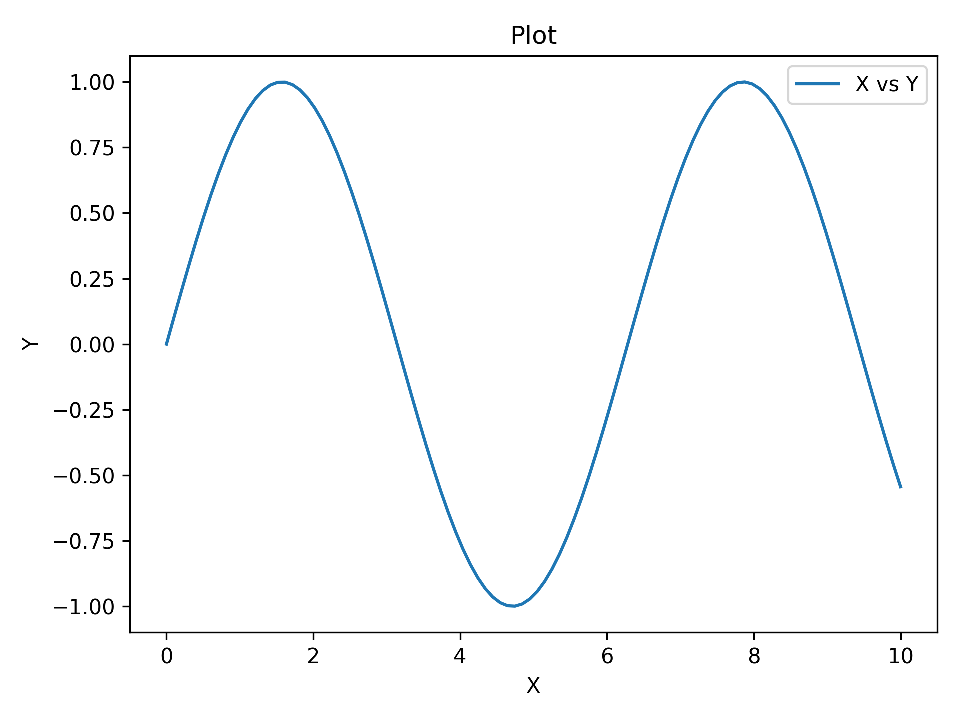
The absolute minimum code to produce a labeled plot. auto_label=True generates
"X", "Y", and "Plot" as axis and title labels automatically.
import matplotlib.pyplot as plt
import numpy as np

from plotez import plot_xy

x = np.linspace(0, 10, 100)
y = np.sin(x)
plot_xy(x, y, data_label="X vs Y")
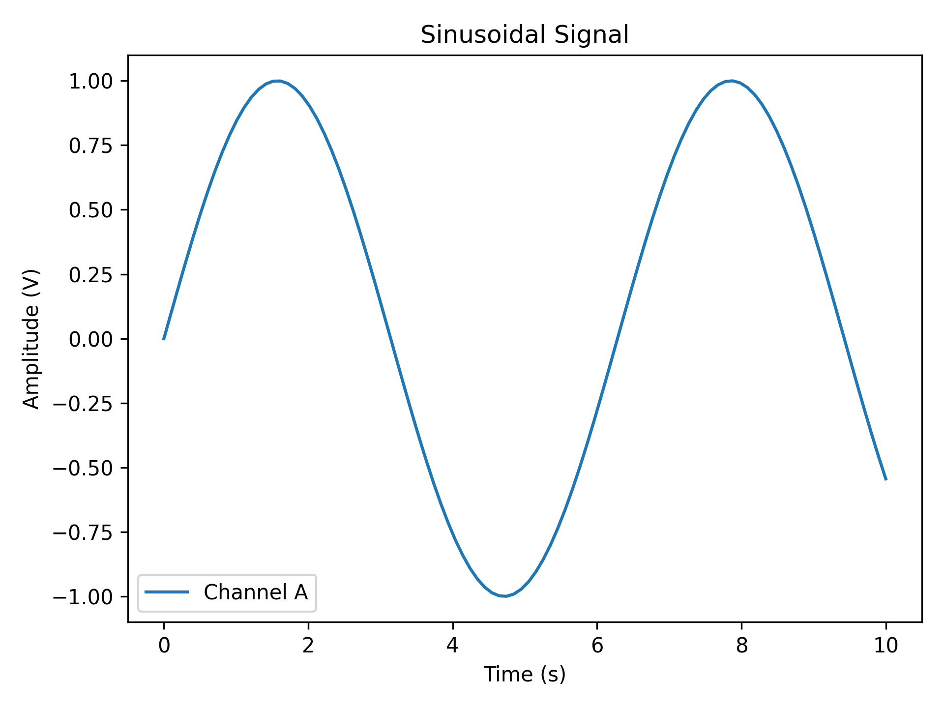
Custom Labels
Replace auto-generated labels with meaningful scientific ones. data_label appears
in the legend; all label strings support LaTeX notation (e.g. r'$\sin(x)$').
import matplotlib.pyplot as plt
import numpy as np

from plotez import plot_xy

x = np.linspace(0, 10, 100)
y = np.sin(x)

plot_xy(
    x_data=x,
    y_data=y,
    x_label="Time (s)",
    y_label="Amplitude (V)",
    data_label="Channel A",
    plot_title="Sinusoidal Signal",
)
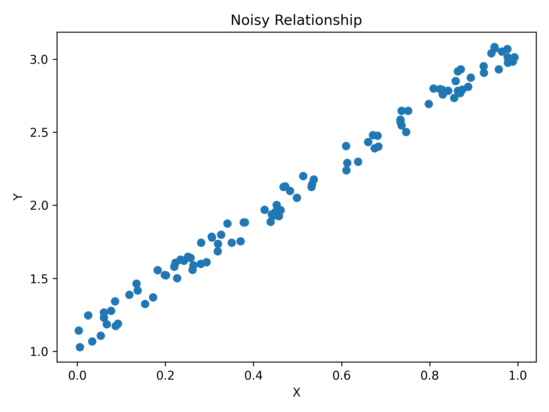
Scatter Plot
Pass is_scatter=True to switch from a line to a scatter plot — same function,
same parameters, one flag.
import matplotlib.pyplot as plt
import numpy as np

from plotez import plot_xy

# set a default generator for reproducibility
rng = np.random.default_rng(1234)

x = rng.random(100)
y = 2 * x + 1 + rng.random(x.shape) * 0.2
Error Visualization
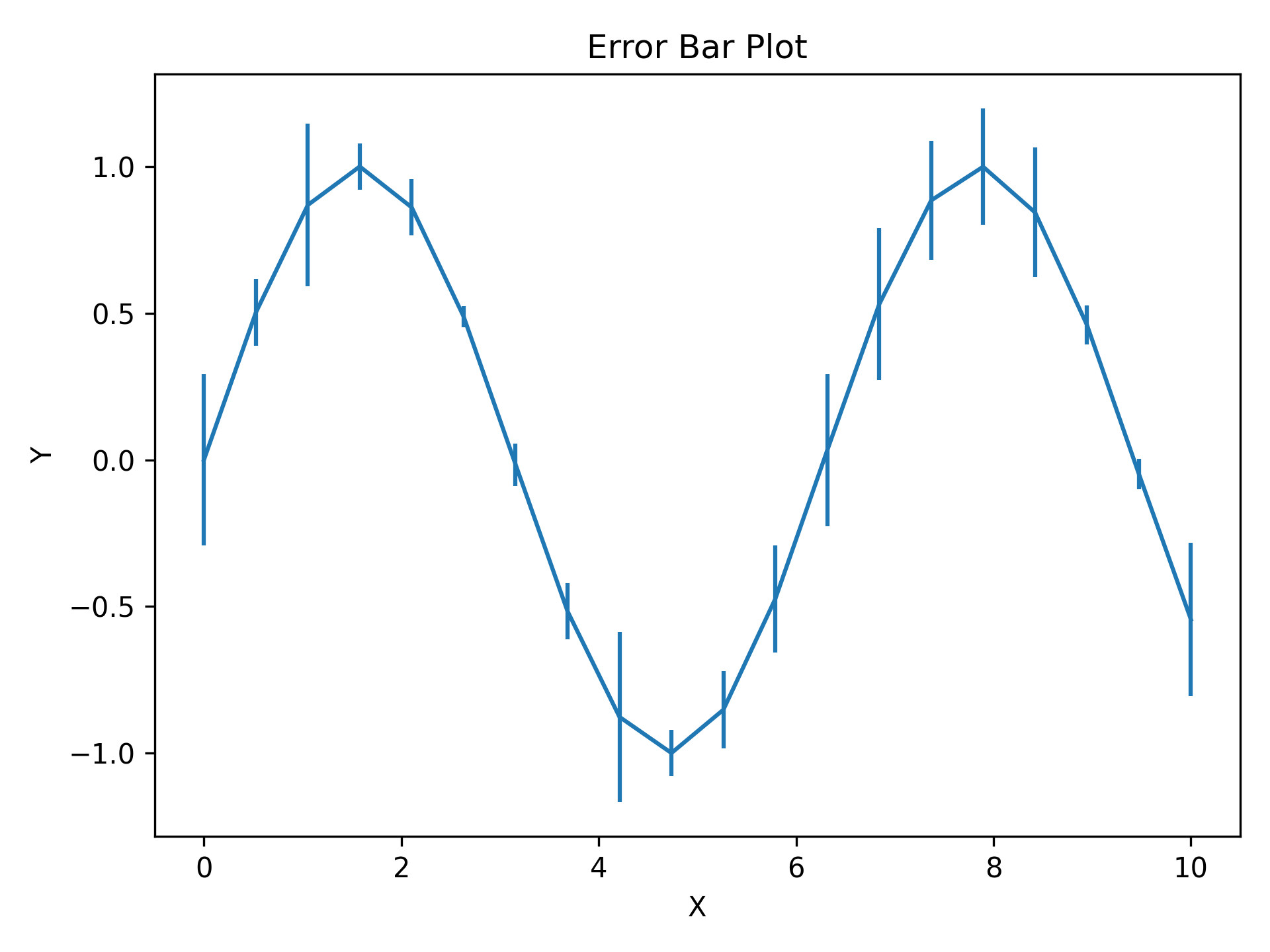
Basic Error Bars
y_err (and x_err) can be a scalar (same error everywhere) or an array
(per-point errors). Caps are shown by default and controlled via capsize.
import matplotlib.pyplot as plt
import numpy as np

from plotez import plot_errorbar

rng = np.random.default_rng(1234)

x = np.linspace(0, 10, 20)
y = np.sin(x)
y_err = 0.3 * rng.random(size=y.shape)

plot_errorbar(x, y, y_err=y_err)
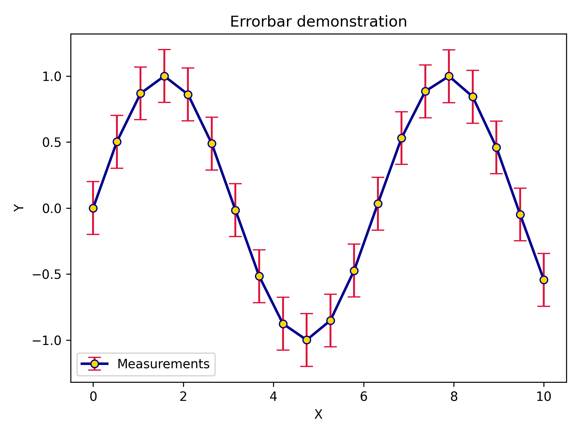
Styled Error Bars
ErrorPlotConfig exposes every line styling option plus specialized error bar
parameters. ecolor sets the error bar colour independently from the line colour;
elinewidth sets the error bar line thickness.
import matplotlib.pyplot as plt
import numpy as np

from plotez import plot_errorbar
from plotez.backend import ErrorPlotConfig

x = np.linspace(0, 10, 20)
y = np.sin(x)
y_err = 0.2

ep = ErrorPlotConfig(
    color="darkblue",  # Line and marker color
    linewidth=2,
    marker="o",
    markersize=6,
    capsize=5,
    ecolor="crimson",  # Error bar color (different!)
    elinewidth=1.5,
    markerfacecolor="gold",
)
plot_errorbar(
    x_data=x,
    y_data=y,
    y_err=y_err,
    x_label="X",
    y_label="Y",
    plot_title="Errorbar demonstration",
    data_label="Measurements",
    errorbar_config=ep,
)
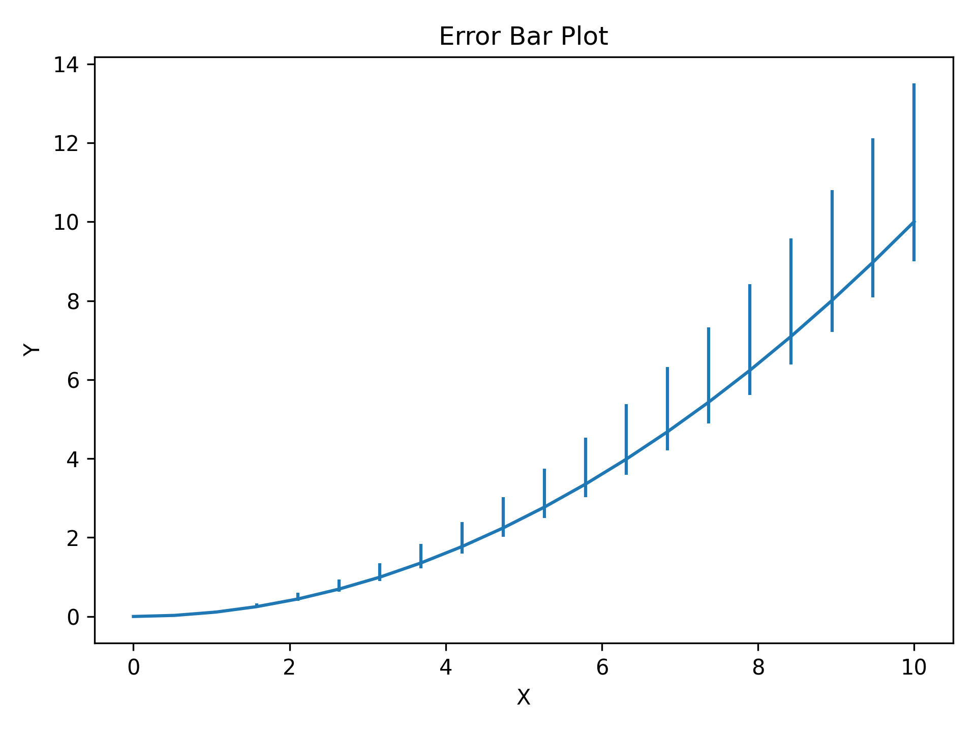
Asymmetric Errors
Pass a (2, N) array to y_err (or x_err) for different lower and upper
uncertainties — first row is lower errors, second row is upper errors.
import matplotlib.pyplot as plt
import numpy as np

from plotez import plot_errorbar

x = np.linspace(0, 10, 20)
y = x**2 / 10

# Shape (2, N): [lower_errors, upper_errors]
y_err = np.array([0.1 * y, 0.35 * y])  # Lower (10% of value)  # Upper  (35% of value)
plot_errorbar(x, y, y_err=y_err)
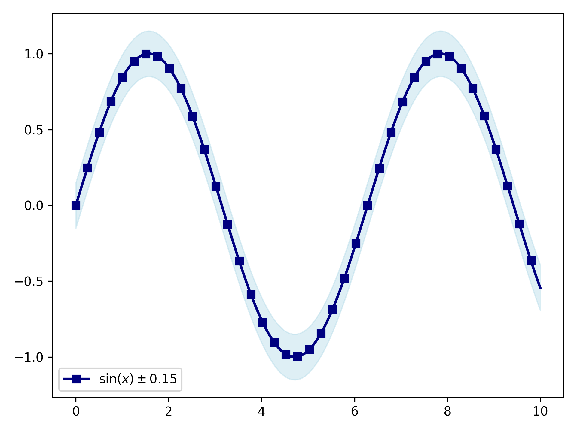
Error Bands
For dense, continuous data shaded bands are cleaner than individual error bars.
y_lower and y_upper are absolute values (not offsets); band_config
controls the fill and line_config controls the central line.
import matplotlib.pyplot as plt
import numpy as np

from plotez import plot_errorband
from plotez.backend import ErrorBandConfig, LinePlotConfig

x = np.linspace(0, 10, 200)  # Dense sampling
y = np.sin(x)
y_lower = y - 0.15
y_upper = y + 0.15

band_cfg = ErrorBandConfig(color="lightblue", alpha=0.4)
line_cfg = LinePlotConfig(color="navy", linewidth=2, marker="s", _extra={"markevery": 5})

plot_errorband(
    x_data=x,
    y_data=y,
    y_lower=y_lower,
    y_upper=y_upper,
    data_label=r"$\sin(x) \pm 0.15$",
    band_config=band_cfg,
    line_config=line_cfg,
)
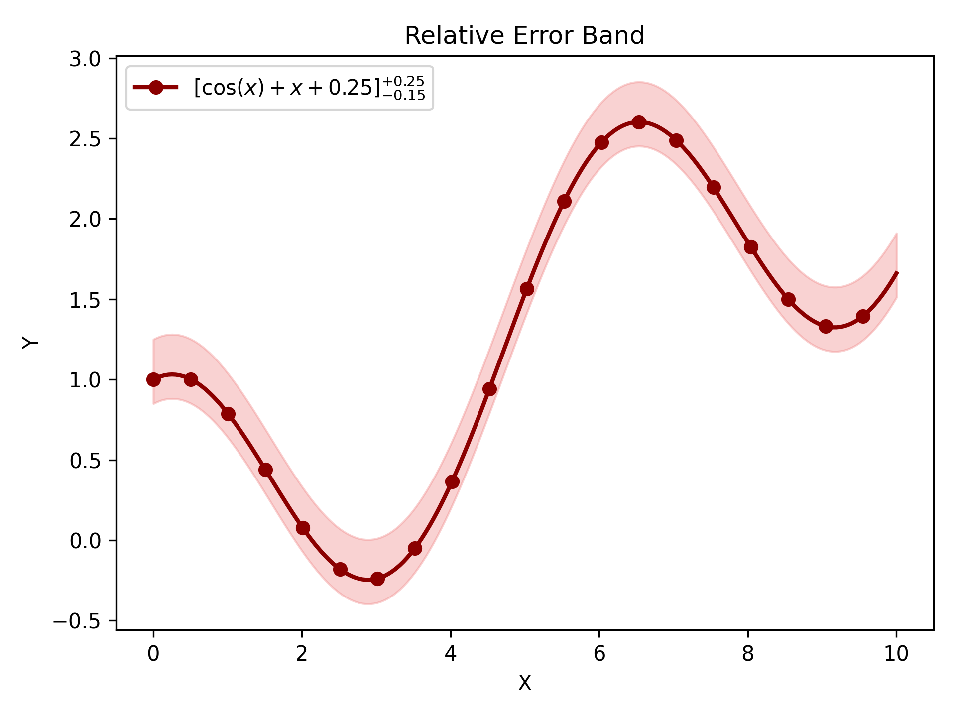
Relative Error Band
plot_errorband_relative is a convenience wrapper around plot_errorband where
y_lower and y_upper are offsets from y_data rather than absolute bounds —
so you can pass a single uncertainty value and let plotEZ compute the band edges.
import matplotlib.pyplot as plt
import numpy as np

from plotez import ebc, lpc, plot_errorband_relative

x = np.linspace(0, 10, 200)
y = np.cos(x) + x * 0.25
y_err_lower = 0.15
y_err_upper = 0.25

band_cfg = ebc(c="lightcoral", alpha=0.35)
line_cfg = lpc(c="darkred", lw=2, markevery=10, marker="o")

f, ax = plot_errorband_relative(
    x_data=x,
    y_data=y,
    y_lower=y_err_lower,
    y_upper=y_err_upper,
    x_label="X",
    y_label="Y",
    plot_title="Relative Error Band",
    data_label=r"$[\cos(x) + x + 0.25]^{+0.25}_{-0.15}$",
    band_config=band_cfg,
Multi-Panel Layouts
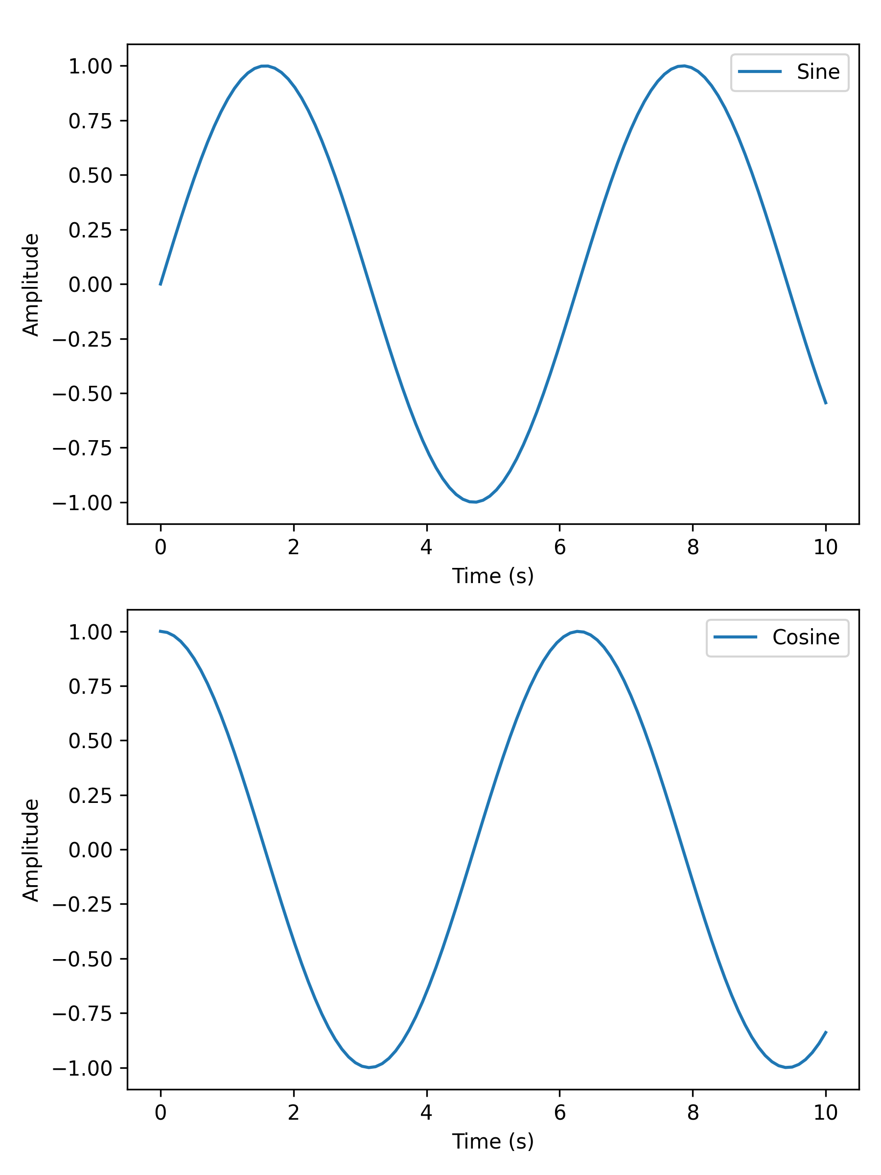
Two Subplots
two_subplots wraps n_plotter for the common two-panel case.
Use orientation='h' for side-by-side or 'v' for stacked; subplot_title
labels each panel individually.
import matplotlib.pyplot as plt
import numpy as np

from plotez import two_subplots

x = np.linspace(0, 10, 100)
y1 = np.sin(x)
y2 = np.cos(x)

two_subplots(
    x_data=[x, x],
    y_data=[y1, y2],
    orientation="v",  # works with both 'v' and 'vertical'
    x_labels=["Time (s)", "Time (s)"],
    y_labels=["Amplitude", "Amplitude"],
    data_labels=["Sine", "Cosine"],
    figure_kwargs={"figsize": (6, 8)},
)
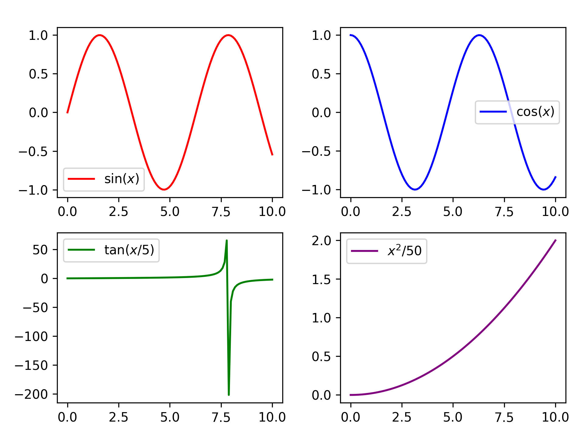
Grid of Four
n_plotter handles arbitrary N×M grids. Config parameters passed as lists
apply per-subplot, cycling if the list is shorter than the panel count.
import matplotlib.pyplot as plt
import numpy as np

from plotez import n_plotter
from plotez.backend import LinePlotConfig

x_data = [np.linspace(0, 10, 100) for _ in range(4)]
y_data = [np.sin(x_data[0]), np.cos(x_data[1]), np.tan(x_data[2] / 5), x_data[3] ** 2 / 50]

config = LinePlotConfig(color=["red", "blue", "green", "purple"])

n_plotter(
    x_data=x_data,
    y_data=y_data,
    n_rows=2,
    n_cols=2,
    data_labels=[r"$\sin(x)$", r"$\cos(x)$", r"$\tan(x/5)$", r"$x^2$/50"],
    plot_config=config,
)
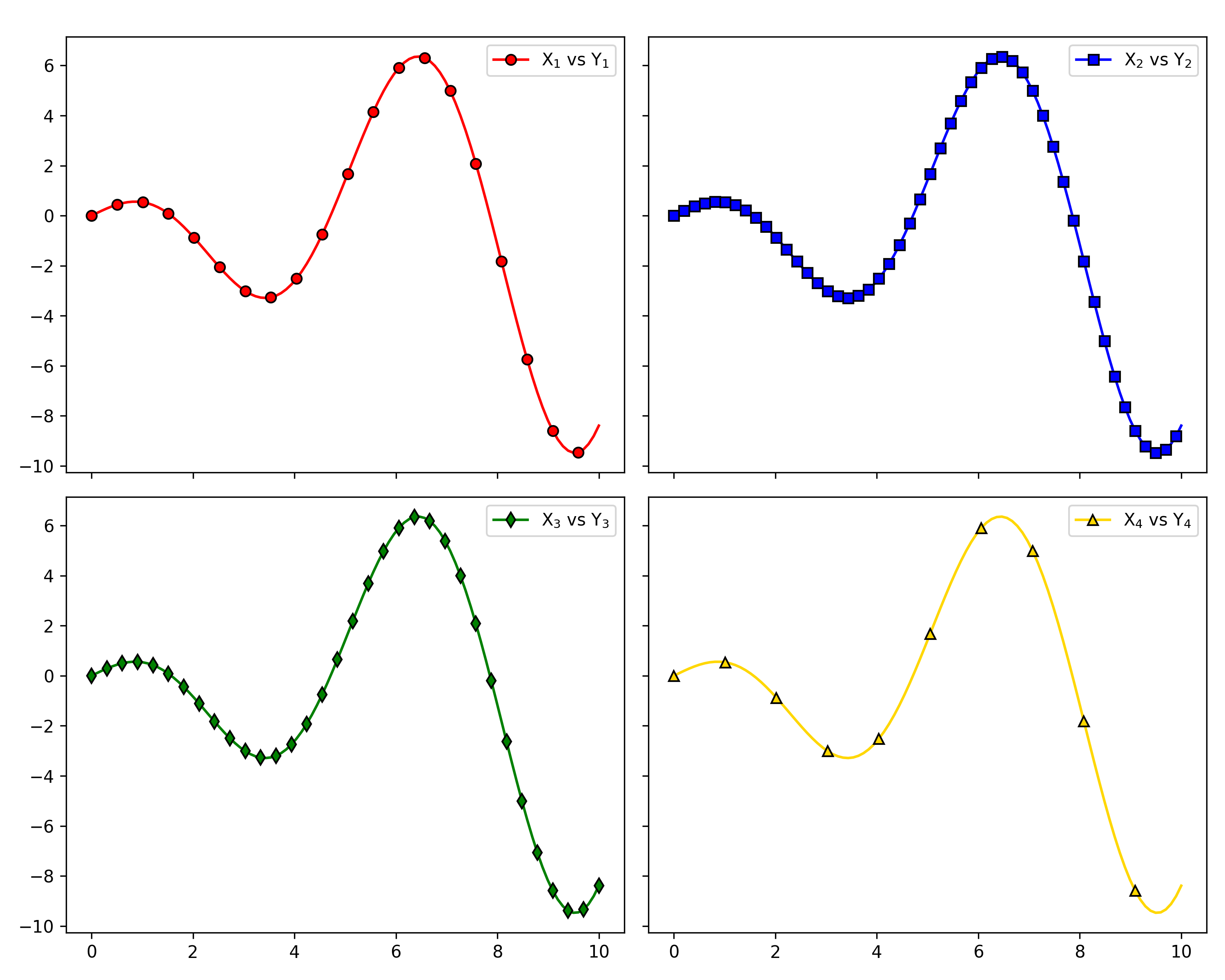
Shared Axes
Pass figure_kwargs={"sharex": True, "sharey": True} to lock axis
ranges across all panels — redundant tick labels are hidden automatically.
import matplotlib.pyplot as plt
import numpy as np

from plotez import LinePlotConfig, n_plotter

rng = np.random.default_rng(1234)

x_data = [np.linspace(0, 10, 100) for _ in range(4)]
y_data = [x * np.cos(x) for x in x_data]

fig_kwargs = {"sharex": True, "sharey": True, "figsize": (10, 8)}
line_plot_cfg = LinePlotConfig(
    color=["red", "blue", "green", "gold"],
    markeredgecolor=["k"] * 4,
    marker=["o", "s", "d", "^"],
    _extra={"markevery": [5, 2, 3, 10]},
)

n_plotter(
    x_data=x_data,
    y_data=y_data,
    n_rows=2,
    n_cols=2,
    plot_config=line_plot_cfg,
    figure_kwargs=fig_kwargs,
    data_labels=["X$_1$ vs Y$_1$", "X$_2$ vs Y$_2$", "X$_3$ vs Y$_3$", "X$_4$ vs Y$_4$"],
)
Customization
Config Classes
LinePlotConfig (and its siblings ErrorPlotConfig, ErrorBandConfig,
ScatterPlotConfig) give full IDE autocomplete and are
reusable across multiple plots. Any matplotlib parameter not covered by a
named field can be forwarded via the _extra dict.
import matplotlib.pyplot as plt
import numpy as np

from plotez import plot_errorbar
from plotez.backend import ErrorPlotConfig

x = np.linspace(0, 10, 20)
y = np.sin(x)
y_err = 0.2

ep = ErrorPlotConfig(
    color="darkblue",  # Line and marker color
    linewidth=2,
    marker="o",
    markersize=6,
    capsize=5,
    ecolor="crimson",  # Error bar color (different!)
    elinewidth=1.5,
    markerfacecolor="gold",
    _extra={"markevery": 2},  # The `_extra` keyword can take non-defined matplotlib keywords
)
plot_errorbar(
    x_data=x,
    y_data=y,
    y_err=y_err,
    x_label="X",
    y_label="Y",
    plot_title="Errorbar demonstration",
    data_label="Measurements",
    errorbar_config=ep,
)

Shorthand Helpers
lpc, epc, ebc, spc, and hgc are factory functions that accept
familiar matplotlib aliases (c, lw, ls, ms, mec, mfc) and
return the corresponding config object — no class import required.
from plotez import lpc, epc, ebc, spc, hgc

line = lpc(c='steelblue', lw=2, ls='--', marker='o', ms=4)
ep = epc(c='darkblue', ls=':', lw=2, marker='d', ms=6, capsize=8, elinewidth=2, ecolor='red')
band = ebc(c='cyan', alpha=0.3, ec='k', ls='--', hatch='/')
dots = spc(c='orange', s=40, alpha=0.7, marker='^')
hist = hgc(bins=40, c='steelblue', ec='white', alpha=0.8)
See the API Reference page for the full shorthand key reference.
Error Handling
PlotEZ provides domain-specific exceptions for clear, catchable error handling. All exceptions
are available from plotez.backend.error_handling.
Exception Hierarchy
from plotez.backend.error_handling import (
    PlotError,           # Base for all plotting errors
    DataError,           # Base for data-related errors
    ConfigurationError,  # Base for config/parameter errors

    # Data errors
    ShapeError,          # Invalid array shape (e.g., bad error array)
    EmptyDataError,      # Empty required data
    ColumnCountError,    # File doesn't have 2 columns

    # Configuration errors
    OrientationError,    # Invalid plot orientation
    AxisLabelError,      # axis_labels has wrong length
    TwinXDataError,      # x2_data given with use_twin_x=True
    TwinYDataError,      # y2_data given with use_twin_x=False

    # Warnings
    LabelConflictWarning # auto_label overriding user labels
)
Catching Specific Exceptions
Catch specific errors for precise error handling:
import numpy as np
from plotez import plot_errorbar
from plotez.backend.error_handling import ShapeError

x = np.array([1, 2, 3])
y = np.array([1, 2, 3])
bad_err = np.array([[1, 2, 3], [4, 5, 6], [7, 8, 9]])  # Wrong shape!

try:
    plot_errorbar(x, y, x_err=bad_err)
except ShapeError as e:
    print(f"Invalid error array: {e}")
Catching by Base Class
Use base classes to catch multiple related errors:
from plotez import plot_with_dual_axes
from plotez.backend.error_handling import DataError, ConfigurationError

try:
    # Your plotting code here
    plot_with_dual_axes([], [1, 2, 3], auto_label=False,
                       axis_labels=['X', 'Y'])
except DataError:
    print("Data-related error occurred")
except ConfigurationError:
    print("Configuration error occurred")
Filtering Warnings
Use Python’s warnings module to filter or escalate custom warnings:
import warnings
from plotez.backend.error_handling import LabelConflictWarning

# Suppress label conflict warnings
warnings.filterwarnings('ignore', category=LabelConflictWarning)

# Or escalate them to errors
warnings.filterwarnings('error', category=LabelConflictWarning)
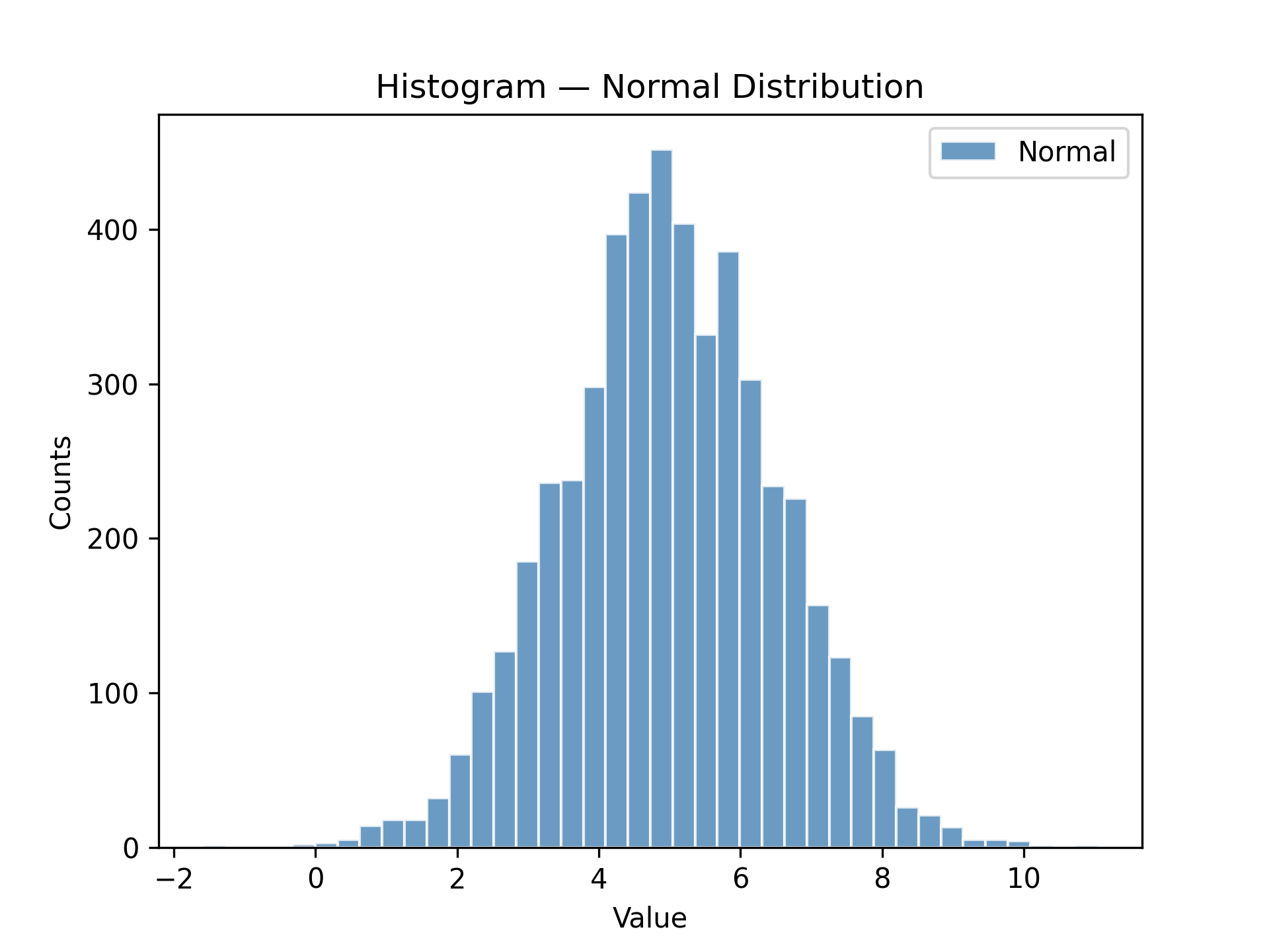
Histogram & Density
Histogram
plot_hist wraps ax.hist with the same consistent config-object pattern used
throughout plotEZ. hgc (short for histogram_config) is the companion factory
function — pass familiar histogram parameters as keyword arguments and get a
HistogramConfig back.
import matplotlib.pyplot as plt
import numpy as np

from plotez import hgc, plot_hist

data = np.genfromtxt("histogram_data.csv", delimiter=",", skip_header=1)
normal_data = data[:, 1]  # second column is 'normal'

h_cfg = hgc(bins=40, color="steelblue", ec="white", alpha=0.8)

f, ax = plot_hist(
    x_data=normal_data,
    x_label="Value",
    y_label="Counts",
    plot_title="Histogram — Normal Distribution",
    data_label="Normal",
    hist_config=h_cfg,
)
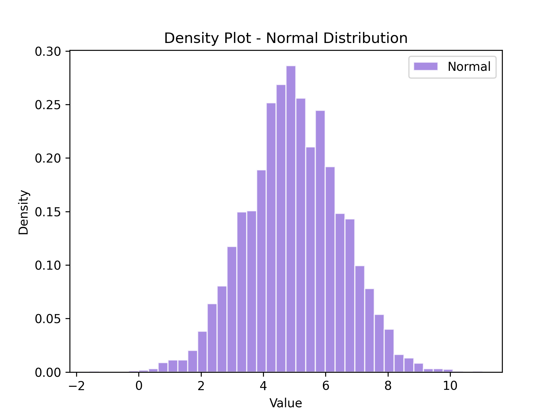
Density Plot
plot_density is a thin wrapper around plot_hist that automatically sets
density=True — the y-axis shows probability density instead of raw counts.
Pass a HistogramConfig (or hgc) as usual; density will be enforced
regardless of the config value.
import matplotlib.pyplot as plt
import numpy as np

from plotez import hgc, plot_density

data = np.genfromtxt("histogram_data.csv", delimiter=",", skip_header=1)
normal_data = data[:, 1]  # second column is 'normal'

h_cfg = hgc(bins=40, color="mediumpurple", ec="white", alpha=0.8)

f, ax = plot_density(
    x_data=normal_data,
    x_label="Value",
    y_label="Density",
    plot_title="Density Plot - Normal Distribution",
    data_label="Normal",
    hist_config=h_cfg,
)
Real-World Workflows
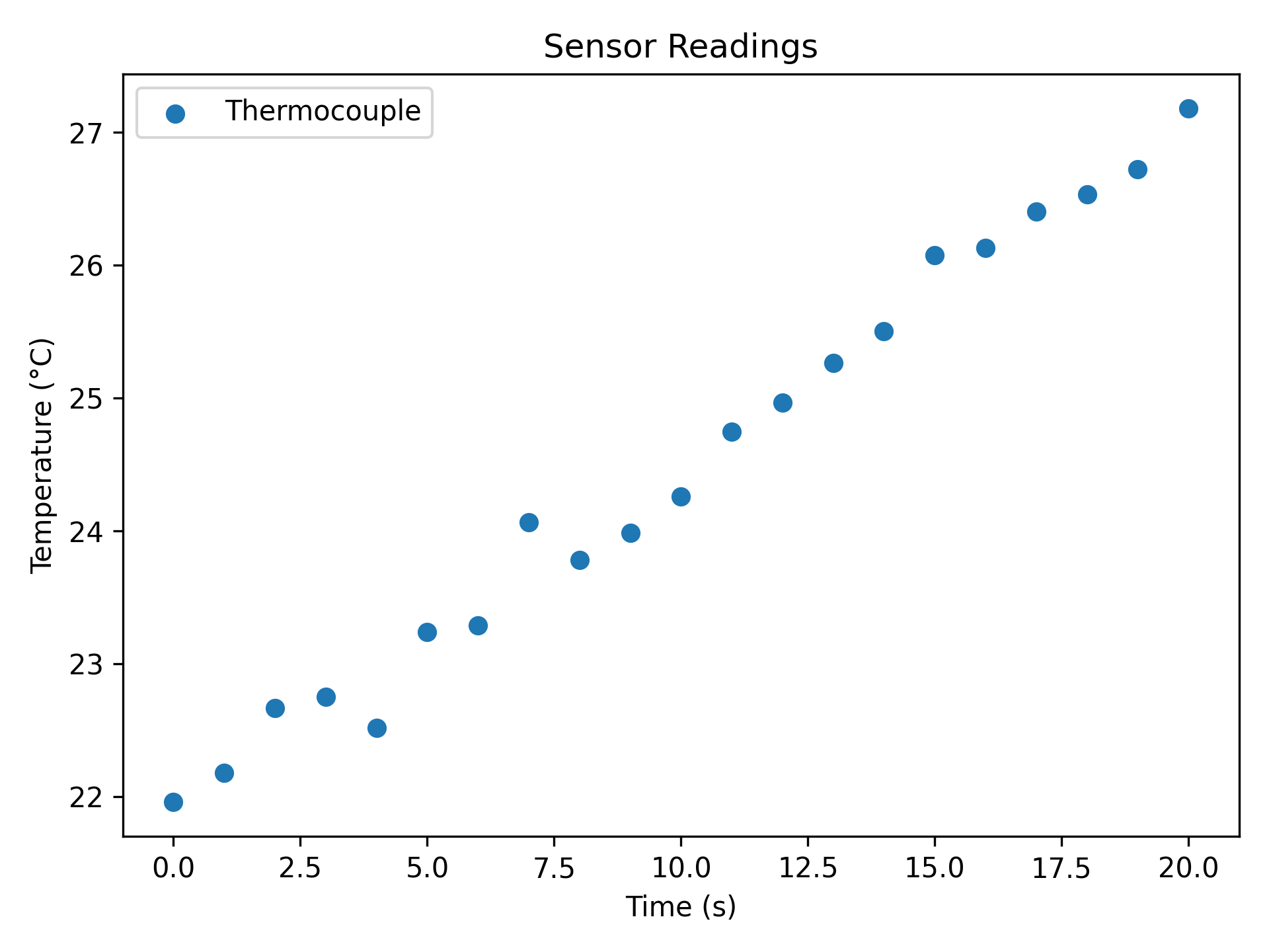
Plotting from CSV Files
plot_two_column_file reads any two-column delimited file directly —
no pandas boilerplate. The file must have exactly two columns (x, y);
use skip_header=True to ignore a header row.
import matplotlib.pyplot as plt

from plotez import plot_two_column_file

plot_two_column_file(
    "sensor_data.csv",
    delimiter=",",
    skip_header=True,
    x_label="Time (s)",
    y_label="Temperature (°C)",
    data_label="Thermocouple",
    plot_title="Sensor Readings",
    is_scatter=True,
)
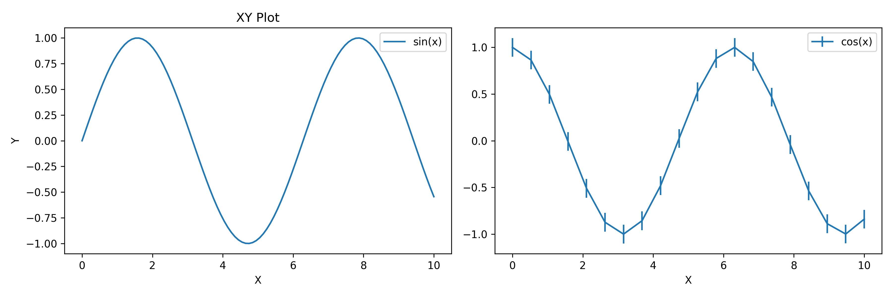
Mixing with Matplotlib
All plotez functions accept an axis keyword so you can drop them
into any existing matplotlib figure. They return the Axes object for
further customisation.
import matplotlib.pyplot as plt
import numpy as np

from plotez import plot_errorbar, plot_xy

fig, (ax1, ax2) = plt.subplots(1, 2, figsize=(12, 4))

# Plotez on first subplot
x = np.linspace(0, 10, 100)
y1 = np.sin(x)
plot_xy(x, y1, x_label="X", y_label="Y", data_label="sin(x)", axis=ax1)

# Plotez on second subplot
x2 = np.linspace(0, 10, 20)
y2 = np.cos(x2)
y_err = 0.1
plot_errorbar(x2, y2, y_err=y_err, x_label="X", data_label="cos(x)", axis=ax2)
Next Steps
See API Reference for complete function and config-class signatures.
Check Changelog for version history.
Browse the
examples/directory for all runnable scripts.