Quick Start Guide
This guide walks through plotez from the simplest possible plot up to real-world workflows.
Every example corresponds to a runnable script in the examples/ directory.
Basic Plotting
Minimal Example
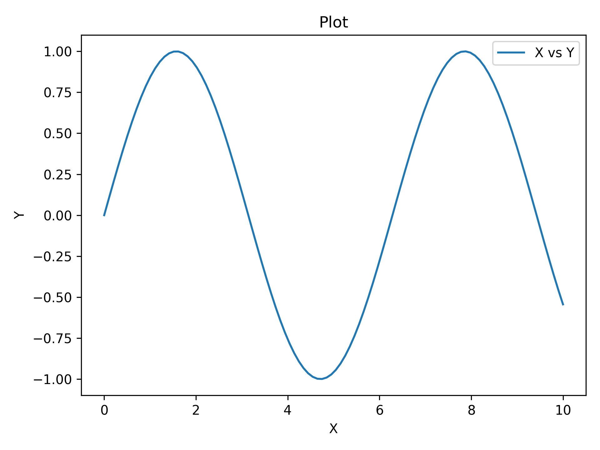
The absolute minimum code to produce a labeled plot. Pass x_label, y_label,
and plot_title for axis and title labels.
import matplotlib.pyplot as plt
import numpy as np

from plotez import plot_xy

x = np.linspace(0, 10, 100)
y = np.sin(x)
plot_xy(x, y, data_label="X vs Y")
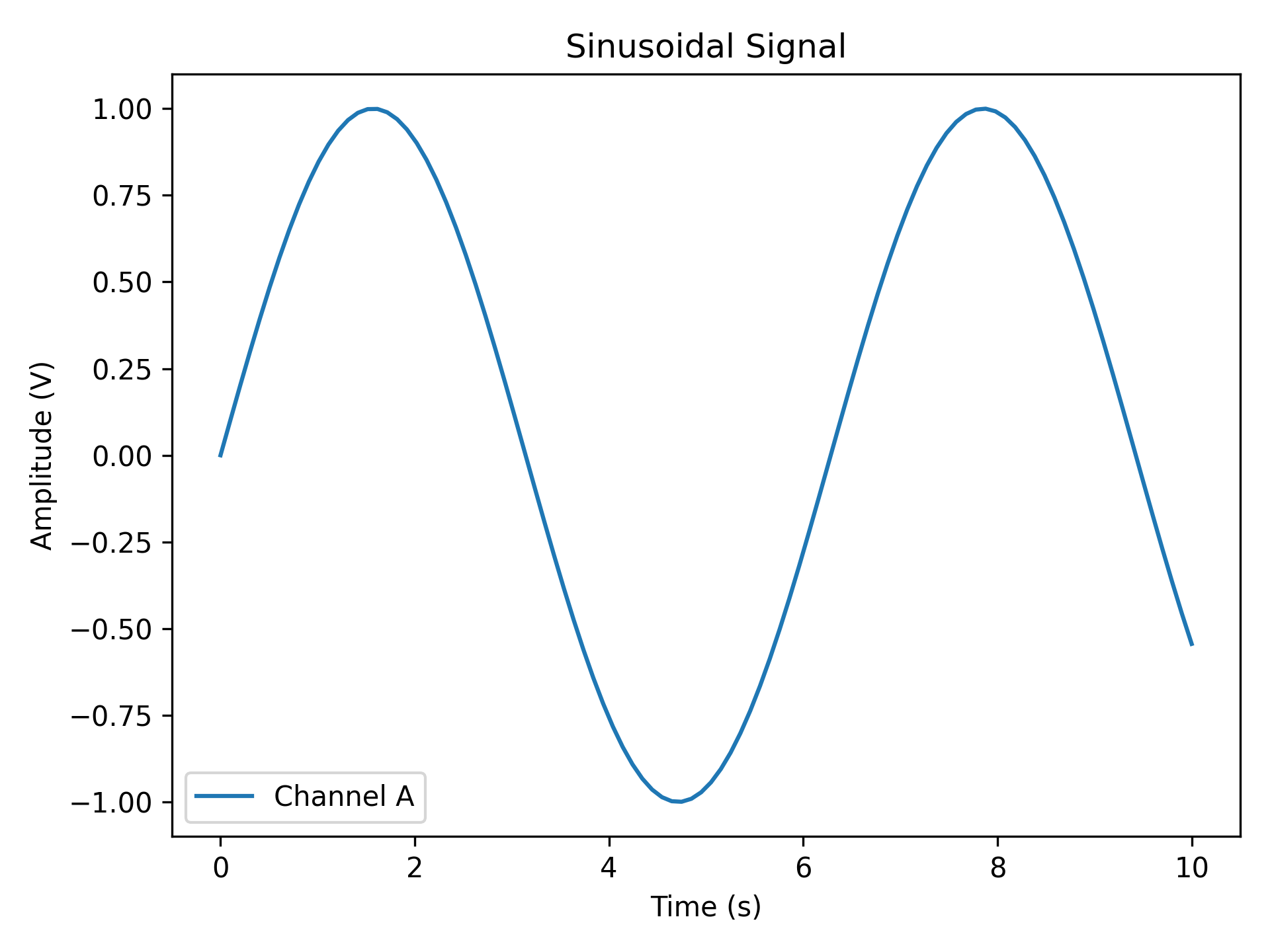
Custom Labels
Replace auto-generated labels with meaningful scientific ones. data_label appears
in the legend; all label strings support LaTeX notation (e.g. r'$\sin(x)$').
import matplotlib.pyplot as plt
import numpy as np

from plotez import plot_xy

x = np.linspace(0, 10, 100)
y = np.sin(x)

plot_xy(
    x_data=x,
    y_data=y,
    x_label="Time (s)",
    y_label="Amplitude (V)",
    data_label="Channel A",
    plot_title="Sinusoidal Signal",
)
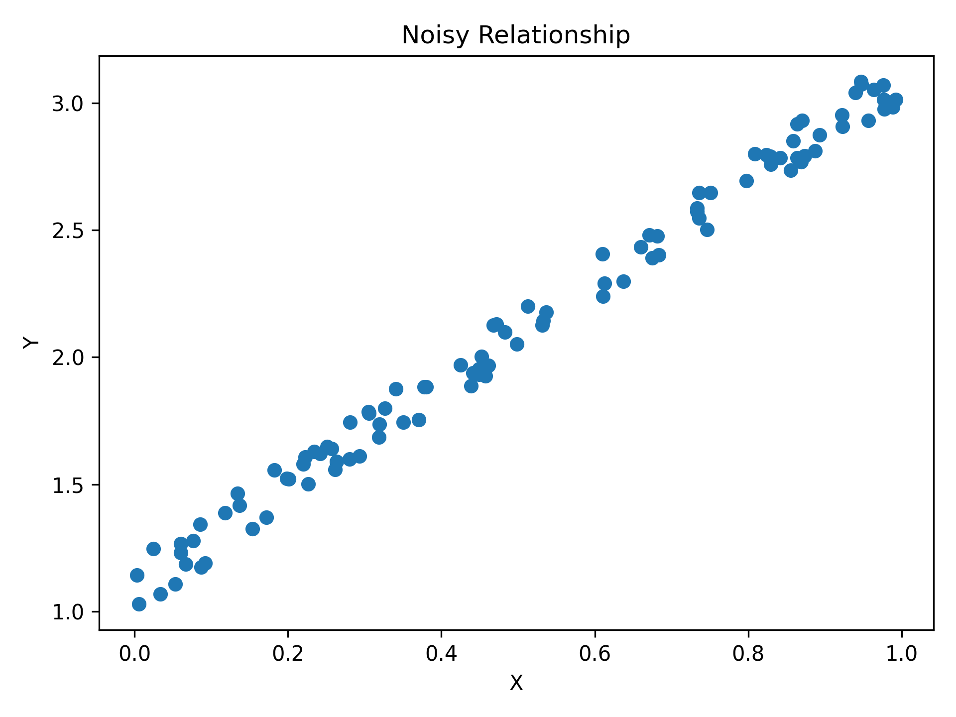
Scatter Plot
Pass is_scatter=True to switch from a line to a scatter plot — same function,
same parameters, one flag.
import matplotlib.pyplot as plt
import numpy as np

from plotez import plot_xy

# set a default generator for reproducibility
rng = np.random.default_rng(1234)

x = rng.random(100)
y = 2 * x + 1 + rng.random(x.shape) * 0.2
Error Visualization
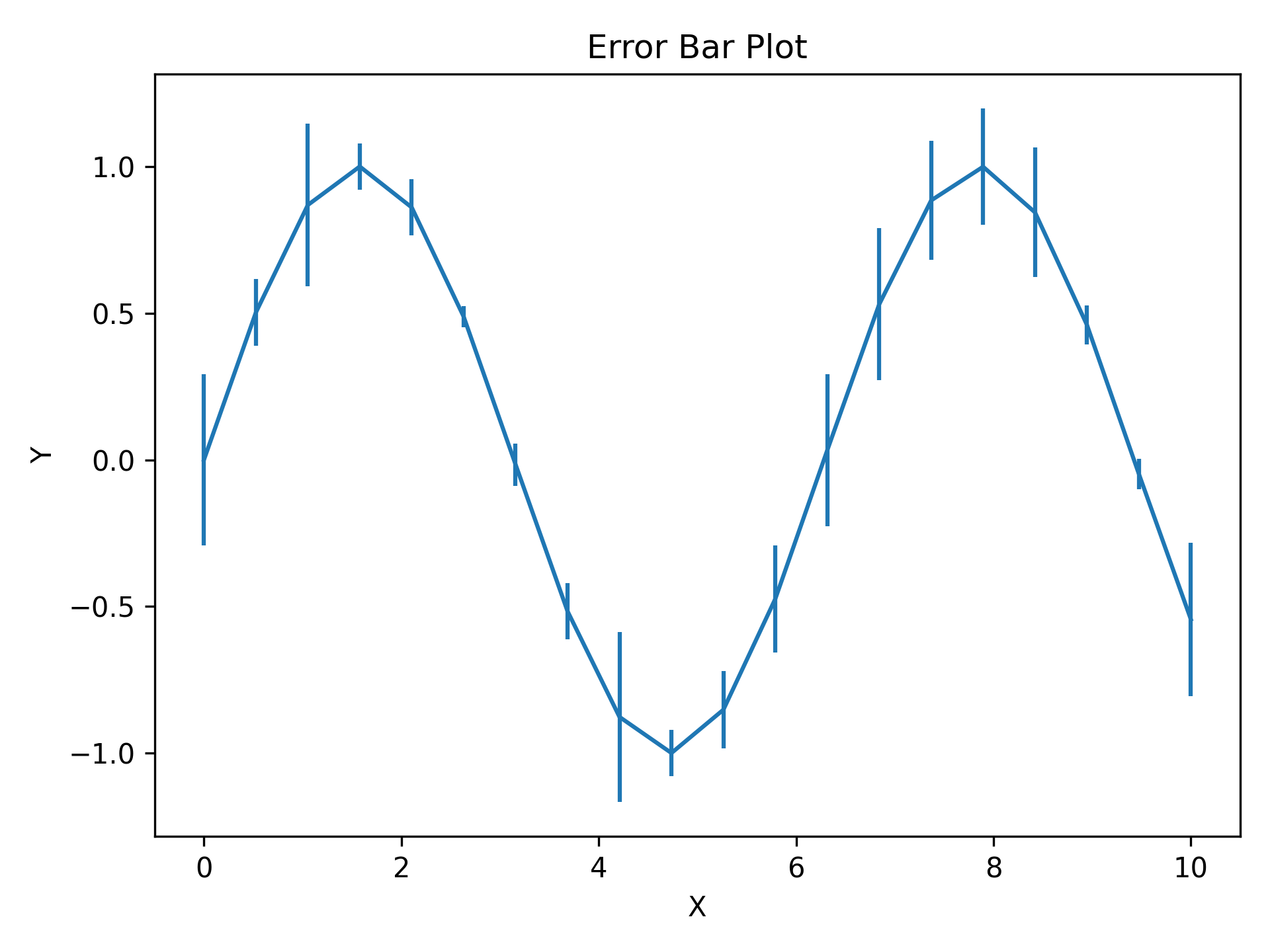
Basic Error Bars
y_err (and x_err) can be a scalar (same error everywhere) or an array
(per-point errors). Caps are shown by default and controlled via capsize.
import matplotlib.pyplot as plt
import numpy as np

from plotez import plot_errorbar

rng = np.random.default_rng(1234)

x = np.linspace(0, 10, 20)
y = np.sin(x)
y_err = 0.3 * rng.random(size=y.shape)

plot_errorbar(x, y, y_err=y_err)
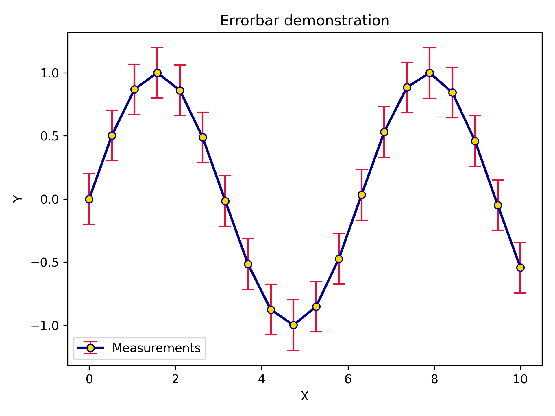
Styled Error Bars
ErrorPlotConfig exposes every line styling option plus specialized error bar
parameters. ecolor sets the error bar colour independently from the line colour;
elinewidth sets the error bar line thickness.
import matplotlib.pyplot as plt
import numpy as np

from plotez import plot_errorbar
from plotez.backend import ErrorPlotConfig

x = np.linspace(0, 10, 20)
y = np.sin(x)
y_err = 0.2

ep = ErrorPlotConfig(
    color="darkblue",  # Line and marker color
    linewidth=2,
    marker="o",
    markersize=6,
    capsize=5,
    ecolor="crimson",  # Error bar color (different!)
    elinewidth=1.5,
    markerfacecolor="gold",
)
plot_errorbar(
    x_data=x,
    y_data=y,
    y_err=y_err,
    x_label="X",
    y_label="Y",
    plot_title="Errorbar demonstration",
    data_label="Measurements",
    errorbar_config=ep,
)
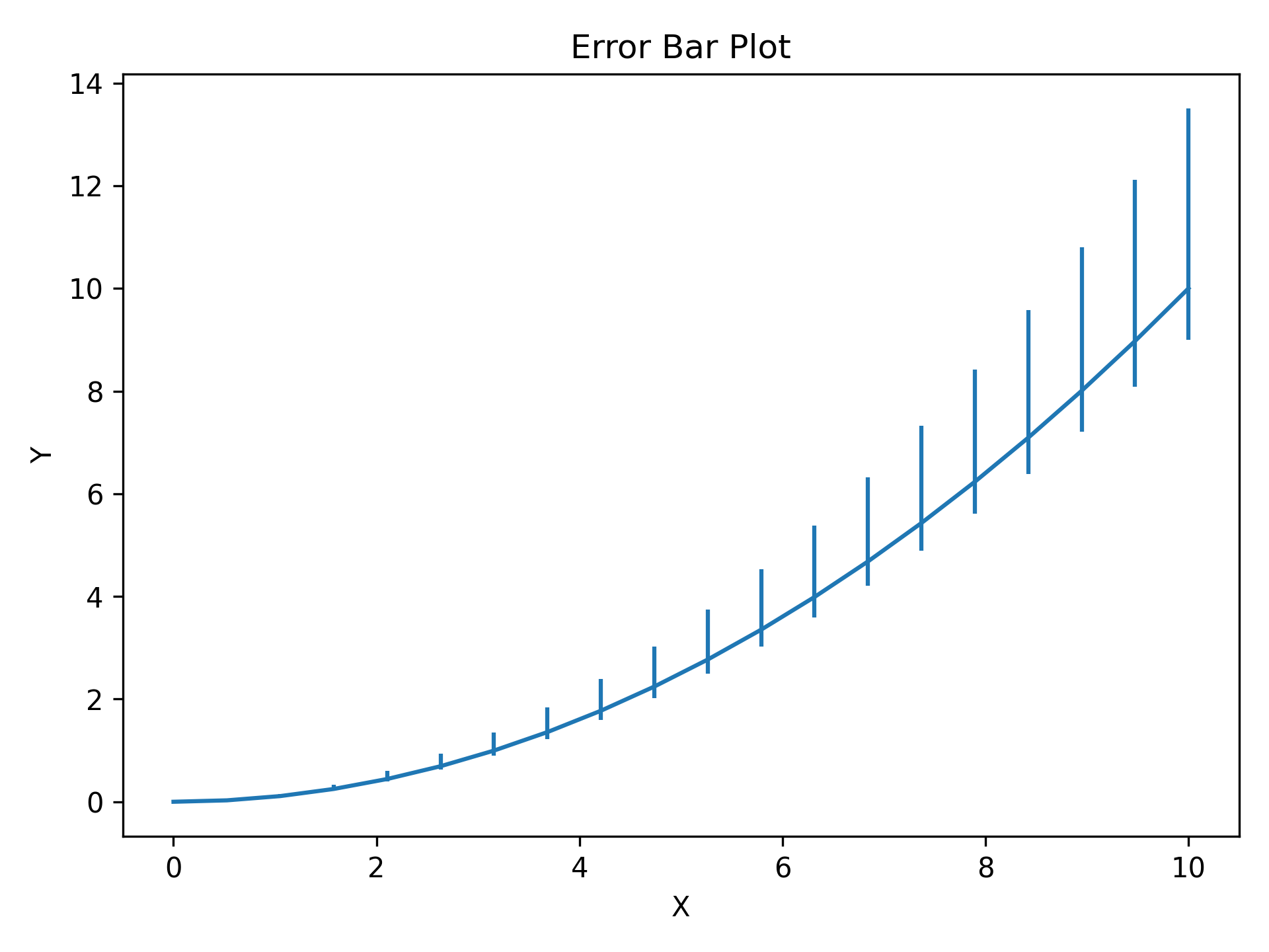
Asymmetric Errors
Pass a (2, N) array to y_err (or x_err) for different lower and upper
uncertainties — first row is lower errors, second row is upper errors.
import matplotlib.pyplot as plt
import numpy as np

from plotez import plot_errorbar

x = np.linspace(0, 10, 20)
y = x**2 / 10

# Shape (2, N): [lower_errors, upper_errors]
y_err = np.array([0.1 * y, 0.35 * y])  # Lower (10% of value)  # Upper  (35% of value)
plot_errorbar(x, y, y_err=y_err)
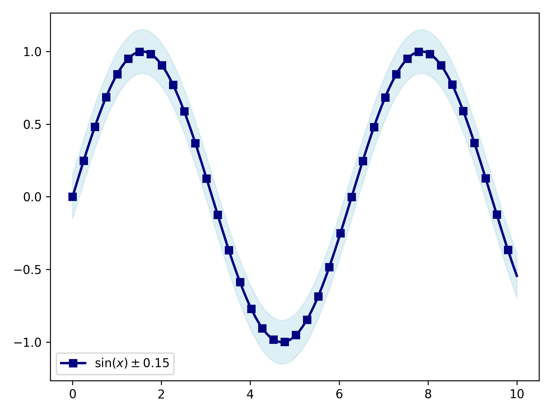
Error Bands
For dense, continuous data shaded bands are cleaner than individual error bars.
y_lower and y_upper are absolute values (not offsets); band_config
controls the fill and line_config controls the central line.
import matplotlib.pyplot as plt
import numpy as np

from plotez import plot_errorband
from plotez.backend import ErrorBandConfig, LinePlotConfig

x = np.linspace(0, 10, 200)  # Dense sampling
y = np.sin(x)
y_lower = y - 0.15
y_upper = y + 0.15

band_cfg = ErrorBandConfig(color="lightblue", alpha=0.4)
line_cfg = LinePlotConfig(color="navy", linewidth=2, marker="s", _extra={"markevery": 5})

plot_errorband(
    x_data=x,
    y_data=y,
    y_lower=y_lower,
    y_upper=y_upper,
    data_label=r"$\sin(x) \pm 0.15$",
    band_config=band_cfg,
    line_config=line_cfg,
)
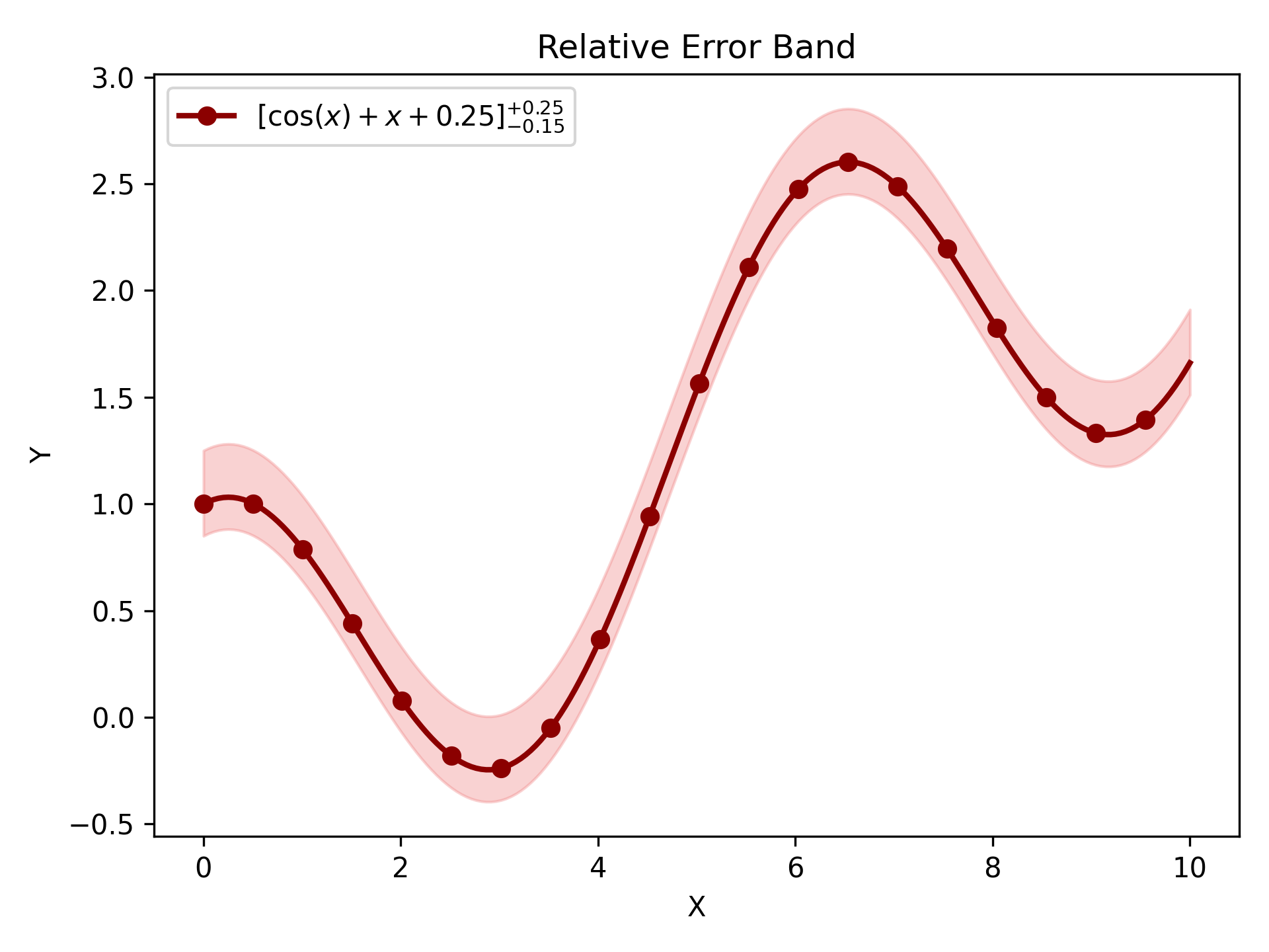
Relative Error Band
plot_errorband_relative is a convenience wrapper around plot_errorband where
y_lower and y_upper are offsets from y_data rather than absolute bounds —
so you can pass a single uncertainty value and let plotEZ compute the band edges.
import matplotlib.pyplot as plt
import numpy as np

from plotez import ebc, lpc, plot_errorband_relative

x = np.linspace(0, 10, 200)
y = np.cos(x) + x * 0.25
y_err_lower = 0.15
y_err_upper = 0.25

band_cfg = ebc(c="lightcoral", alpha=0.35)
line_cfg = lpc(c="darkred", lw=2, markevery=10, marker="o")

ax = plot_errorband_relative(
    x_data=x,
    y_data=y,
    y_lower=y_err_lower,
    y_upper=y_err_upper,
    x_label="X",
    y_label="Y",
    plot_title="Relative Error Band",
    data_label=r"$[\cos(x) + x + 0.25]^{+0.25}_{-0.15}$",
    band_config=band_cfg,
Multi-Panel Layouts
Note
Neither two_subplots nor n_plotter calls tight_layout internally.
Call axs.flat[0].get_figure().tight_layout() (or plt.tight_layout())
yourself after plotting if you want tighter spacing.
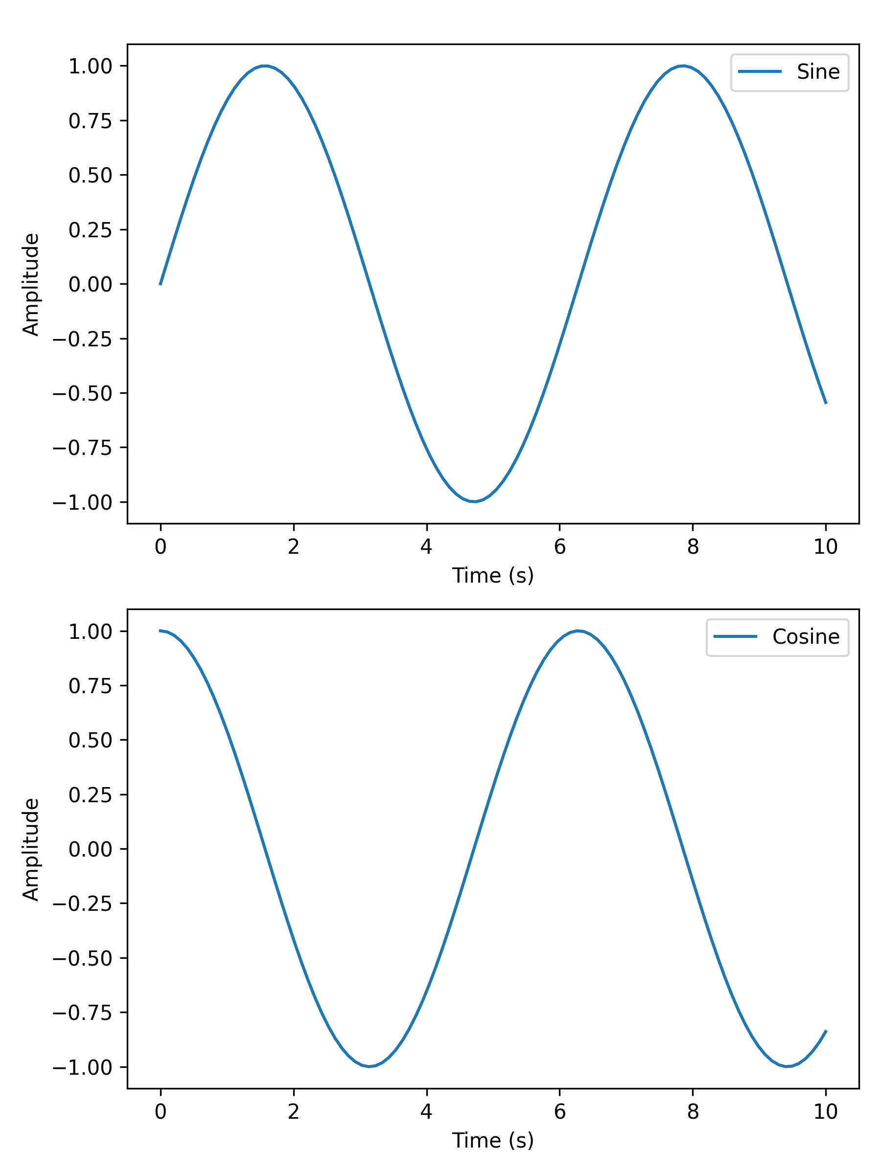
Two Subplots
two_subplots wraps n_plotter for the common two-panel case.
Use orientation='h' for side-by-side or 'v' for stacked; subplot_titles
labels each panel individually.
Returns a shaped (1, 2) (horizontal) or (2, 1) (vertical) ndarray of
Axes; access panels as axs[0, 0] / axs[0, 1] or use axs.flat[i].
import matplotlib.pyplot as plt
import numpy as np

from plotez import two_subplots

x = np.linspace(0, 10, 100)
y1 = np.sin(x)
y2 = np.cos(x)

two_subplots(
    x_data=[x, x],
    y_data=[y1, y2],
    orientation="v",  # works with both 'v' and 'vertical'
    x_labels=("Time (s)", "Time (s)"),
    y_labels=("Amplitude", "Amplitude"),
    data_labels=("Sine", "Cosine"),
    figure_kwargs={"figsize": (6, 8)},
)
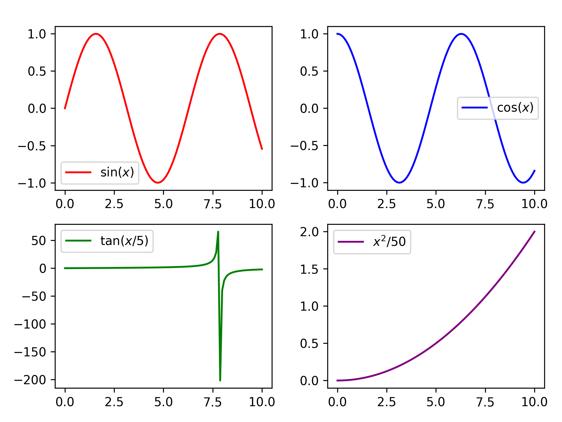
Grid of Four
n_plotter handles arbitrary N×M grids. Config parameters passed as lists
apply per-subplot, cycling if the list is shorter than the panel count.
The function returns a shaped (n_rows, n_cols) ndarray of Axes; use
axs.flat[i] for linear indexing or axs[row, col] for 2-D access.
The parent figure is available via axs.flat[0].get_figure().
import matplotlib.pyplot as plt
import numpy as np

from plotez import n_plotter
from plotez.backend import LinePlotConfig

x_data = [np.linspace(0, 10, 100) for _ in range(4)]
y_data = [np.sin(x_data[0]), np.cos(x_data[1]), np.tan(x_data[2] / 5), x_data[3] ** 2 / 50]

config = LinePlotConfig(color=["red", "blue", "green", "purple"])

n_plotter(
    x_data=x_data,
    y_data=y_data,
    n_rows=2,
    n_cols=2,
    data_labels=[r"$\sin(x)$", r"$\cos(x)$", r"$\tan(x/5)$", r"$x^2$/50"],
    plot_config=config,
)
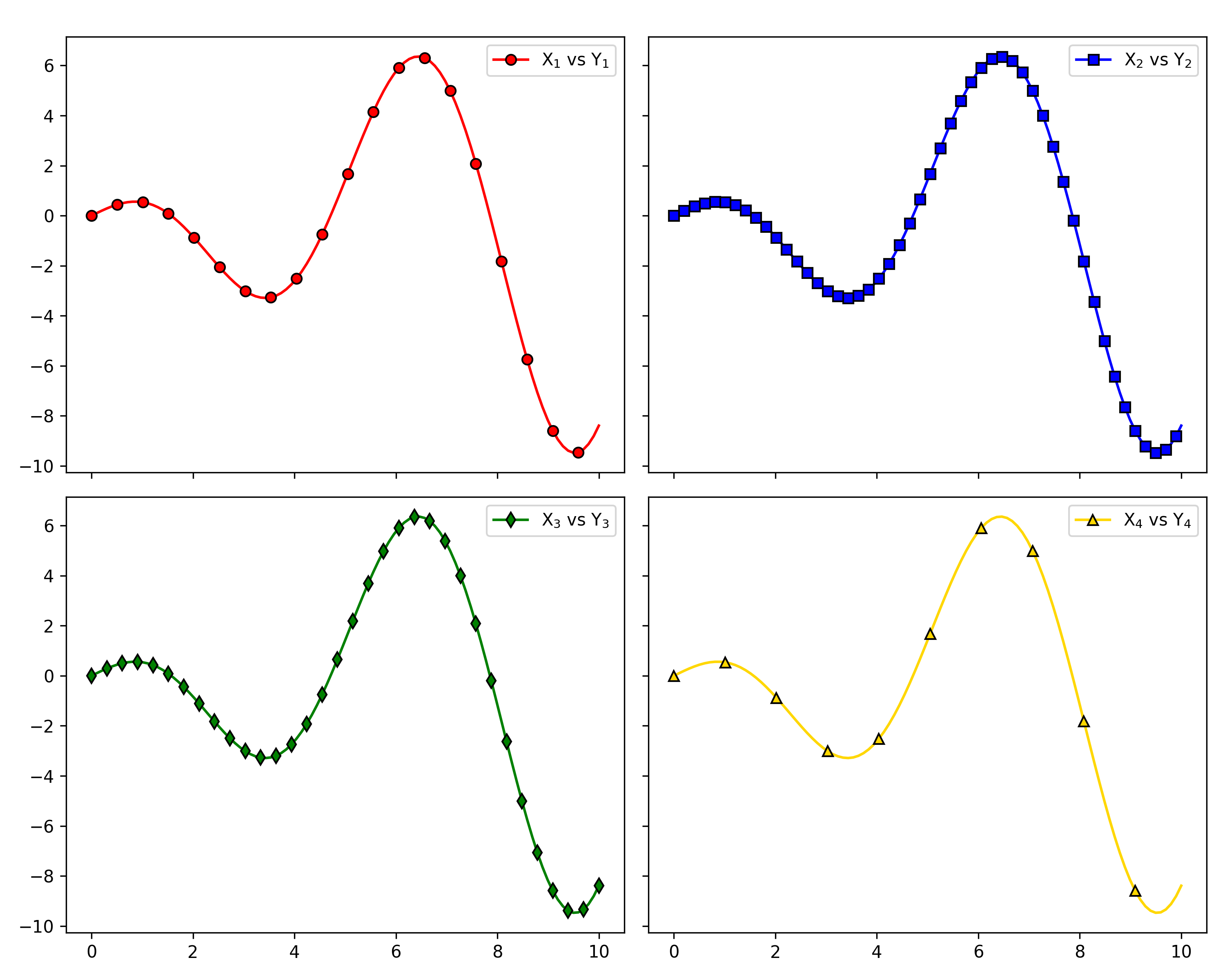
Shared Axes
Pass figure_kwargs={"sharex": True, "sharey": True} to lock axis
ranges across all panels — redundant tick labels are hidden automatically.
import matplotlib.pyplot as plt
import numpy as np

from plotez import LinePlotConfig, n_plotter

rng = np.random.default_rng(1234)

x_data = [np.linspace(0, 10, 100) for _ in range(4)]
y_data = [x * np.cos(x) for x in x_data]

fig_kwargs = {"sharex": True, "sharey": True, "figsize": (10, 8)}
line_plot_cfg = LinePlotConfig(
    color=["red", "blue", "green", "gold"],
    markeredgecolor=["k"] * 4,
    marker=["o", "s", "d", "^"],
    _extra={"markevery": [5, 2, 3, 10]},
)

n_plotter(
    x_data=x_data,
    y_data=y_data,
    n_rows=2,
    n_cols=2,
    plot_config=line_plot_cfg,
    figure_kwargs=fig_kwargs,
    data_labels=["X$_1$ vs Y$_1$", "X$_2$ vs Y$_2$", "X$_3$ vs Y$_3$", "X$_4$ vs Y$_4$"],
)
Customization
Config Classes
LinePlotConfig (and its siblings ErrorPlotConfig, ErrorBandConfig,
ScatterPlotConfig) give full IDE autocomplete and are
reusable across multiple plots. Any matplotlib parameter not covered by a
named field can be forwarded via the _extra dict.
import matplotlib.pyplot as plt
import numpy as np

from plotez import plot_errorbar
from plotez.backend import ErrorPlotConfig

x = np.linspace(0, 10, 20)
y = np.sin(x)
y_err = 0.2

ep = ErrorPlotConfig(
    color="darkblue",  # Line and marker color
    linewidth=2,
    marker="o",
    markersize=6,
    capsize=5,
    ecolor="crimson",  # Error bar color (different!)
    elinewidth=1.5,
    markerfacecolor="gold",
    _extra={"markevery": 2},  # The `_extra` keyword can take non-defined matplotlib keywords
)
plot_errorbar(
    x_data=x,
    y_data=y,
    y_err=y_err,
    x_label="X",
    y_label="Y",
    plot_title="Errorbar demonstration",
    data_label="Measurements",
    errorbar_config=ep,
)

Shorthand Helpers
lpc, epc, ebc, spc, and hgc are factory functions that accept
familiar matplotlib aliases (c, lw, ls, ms, mec, mfc) and
return the corresponding config object — no class import required.
from plotez import lpc, epc, ebc, spc, hgc

line = lpc(c='steelblue', lw=2, ls='--', marker='o', ms=4)
ep = epc(c='darkblue', ls=':', lw=2, marker='d', ms=6, capsize=8, elinewidth=2, ecolor='red')
band = ebc(c='cyan', alpha=0.3, ec='k', ls='--', hatch='/')
dots = spc(c='orange', s=40, alpha=0.7, marker='^')
hist = hgc(bins=40, c='steelblue', ec='white', alpha=0.8)
See the API Reference page for the full shorthand key reference.
Error Handling
PlotEZ provides domain-specific exceptions for clear, catchable error handling. All exceptions
are available from plotez.backend.error_handling.
Exception Hierarchy
from plotez.backend.error_handling import (
    PlotError,           # Base for all plotting errors
    DataError,           # Base for data-related errors
    ConfigurationError,  # Base for config/parameter errors

    # Data errors
    ShapeError,          # Invalid array shape (e.g., bad error array)
    EmptyDataError,      # Empty required data
    ColumnCountError,    # File doesn't have 2 columns

    # Configuration errors
    OrientationError,    # Invalid plot orientation
    AxisLabelError,      # axis_labels has wrong length
    TwinXDataError,      # x2_data given with use_twin_x=True
    TwinYDataError,      # y2_data given with use_twin_x=False
)
Catching Specific Exceptions
Catch specific errors for precise error handling:
import numpy as np
from plotez import plot_errorbar
from plotez.backend.error_handling import ShapeError

x = np.array([1, 2, 3])
y = np.array([1, 2, 3])
bad_err = np.array([[1, 2, 3], [4, 5, 6], [7, 8, 9]])  # Wrong shape!

try:
    plot_errorbar(x, y, x_err=bad_err)
except ShapeError as e:
    print(f"Invalid error array: {e}")
Catching by Base Class
Use base classes to catch multiple related errors:
from plotez import plot_with_dual_axes
from plotez.backend.error_handling import DataError, ConfigurationError

try:
    # Your plotting code here
    plot_with_dual_axes([], [1, 2, 3],
                       axis_labels=("X", "Y", ""))
except DataError:
    print("Data-related error occurred")
except ConfigurationError:
    print("Configuration error occurred")
Mutable-Argument Deprecation Warning
Several label parameters (data_labels, x_labels, y_labels, subplot_titles,
axis_labels) previously accepted mutable list defaults. Passing a plain list
for these arguments now emits a DeprecationWarning; prefer an immutable tuple:
from plotez import two_subplots

axs = two_subplots(x_list, y_list,
                   x_labels=("Time (s)", "Time (s)"),   # tuple — no warning
                   y_labels=("Amplitude", "Phase"))
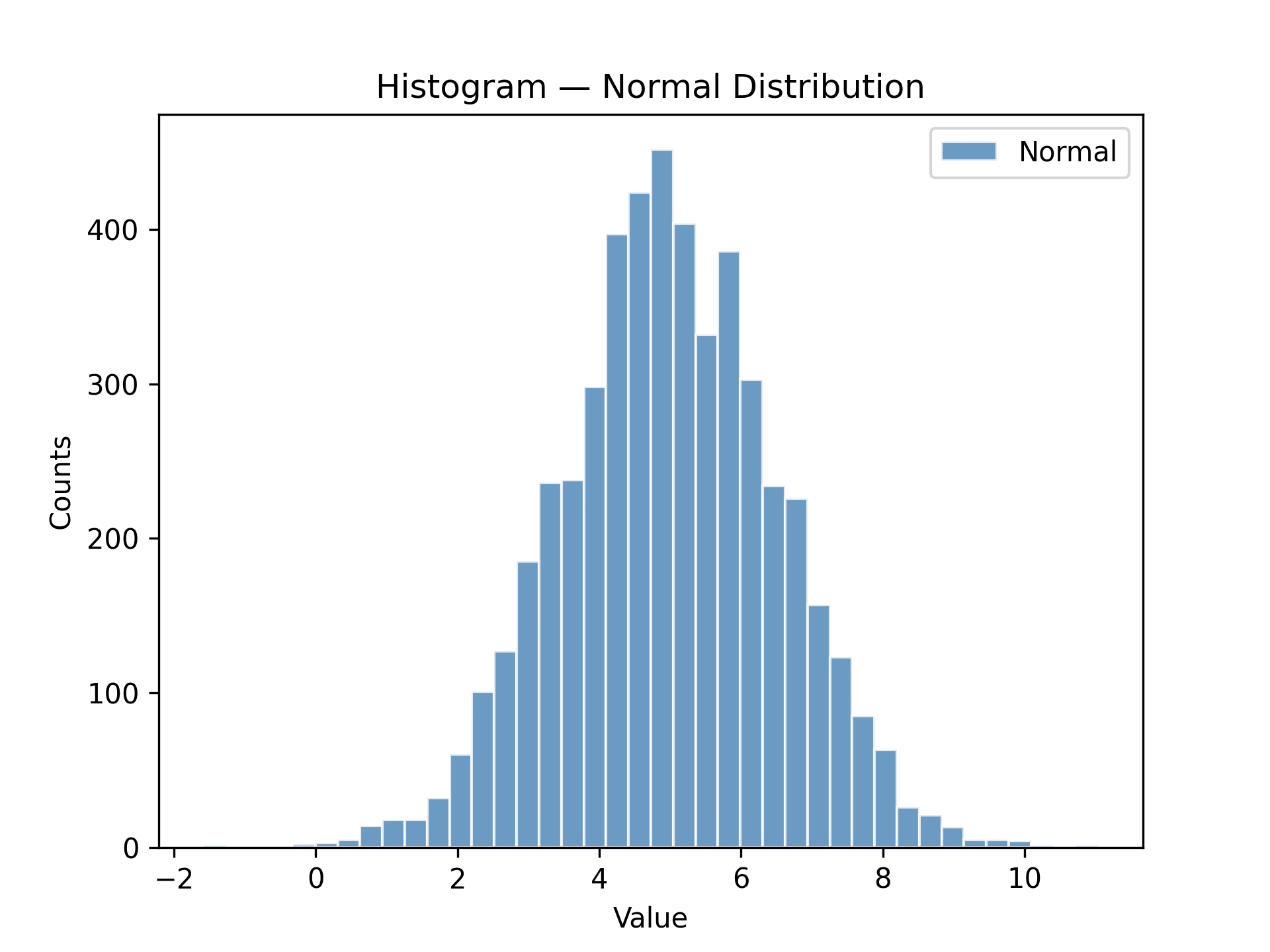
Histogram & Density
Histogram
plot_hist wraps ax.hist with the same consistent config-object pattern used
throughout plotEZ. hgc (short for histogram_config) is the companion factory
function — pass familiar histogram parameters as keyword arguments and get a
HistogramConfig back.
import matplotlib.pyplot as plt
import numpy as np

from plotez import hgc, plot_hist

data = np.genfromtxt("histogram_data.csv", delimiter=",", skip_header=1)
normal_data = data[:, 1]  # second column is 'normal'

h_cfg = hgc(bins=40, color="steelblue", ec="white", alpha=0.8)

ax = plot_hist(
    x_data=normal_data,
    x_label="Value",
    y_label="Counts",
    plot_title="Histogram — Normal Distribution",
    data_label="Normal",
    hist_config=h_cfg,
)
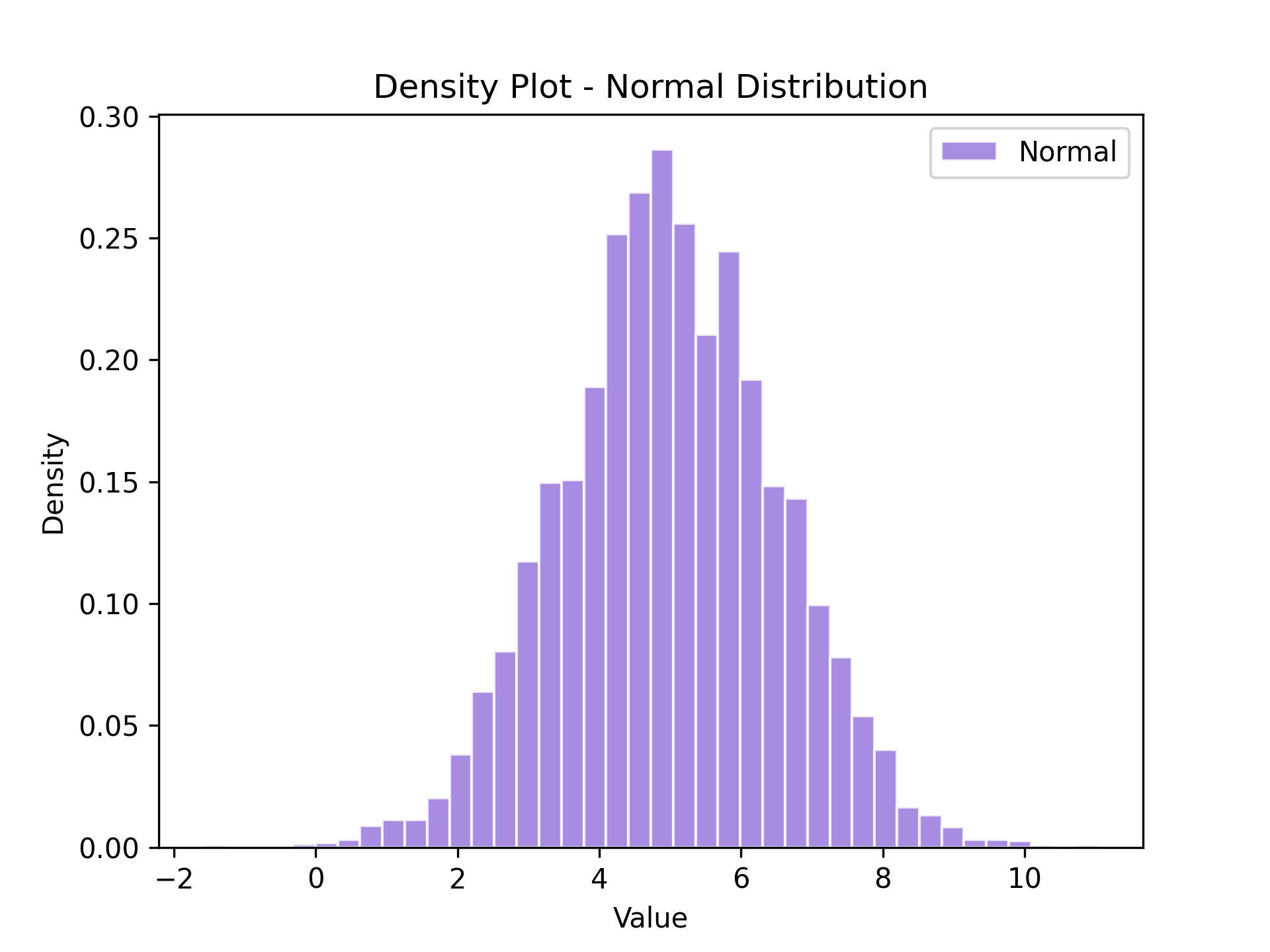
Density Plot
plot_density is a thin wrapper around plot_hist that automatically sets
density=True — the y-axis shows probability density instead of raw counts.
Pass a HistogramConfig (or hgc) as usual; density will be enforced
regardless of the config value.
import matplotlib.pyplot as plt
import numpy as np

from plotez import hgc, plot_density

data = np.genfromtxt("histogram_data.csv", delimiter=",", skip_header=1)
normal_data = data[:, 1]  # second column is 'normal'

h_cfg = hgc(bins=40, color="mediumpurple", ec="white", alpha=0.8)

ax = plot_density(
    x_data=normal_data,
    x_label="Value",
    y_label="Density",
    plot_title="Density Plot - Normal Distribution",
    data_label="Normal",
    hist_config=h_cfg,
)
Real-World Workflows
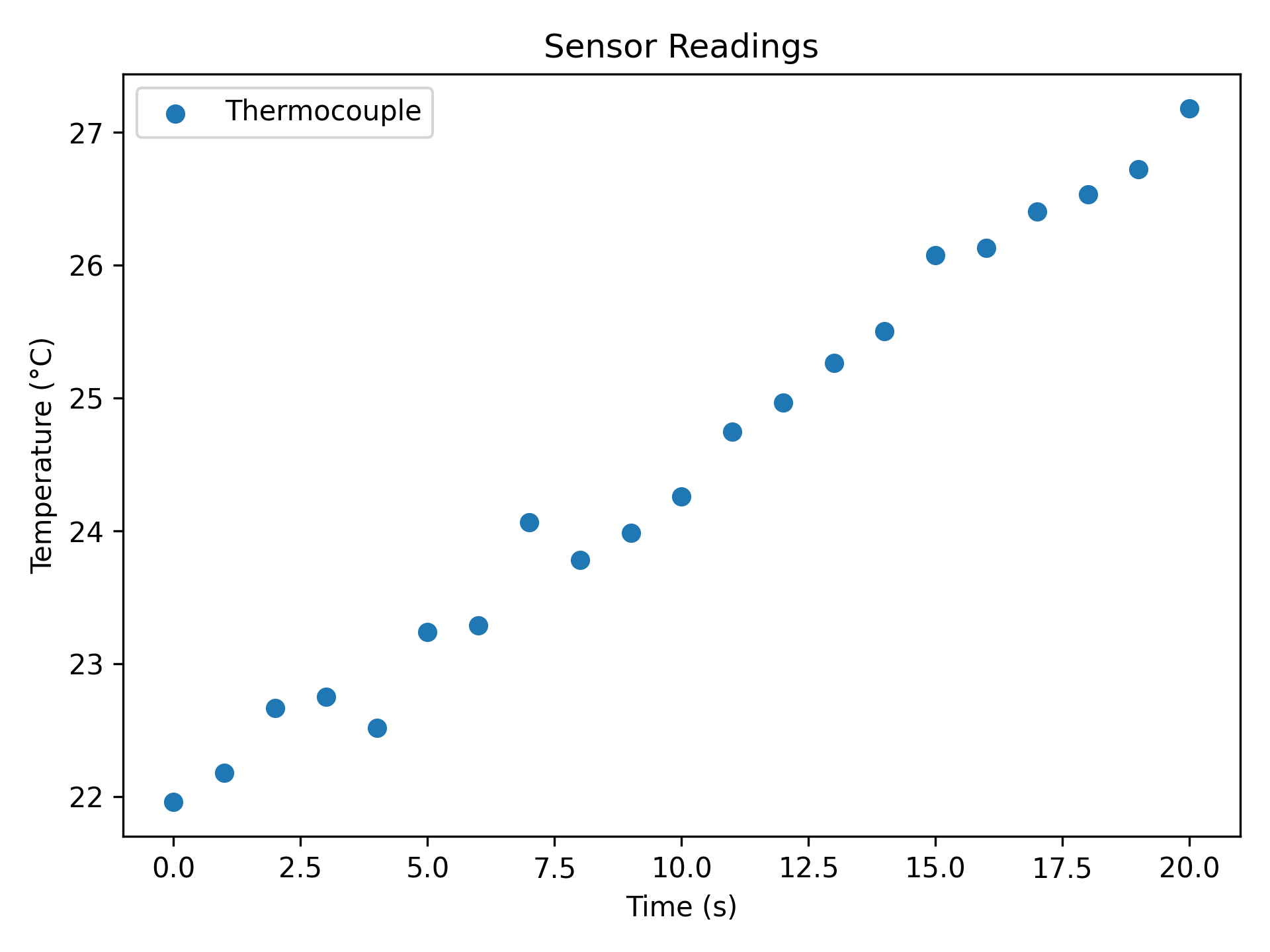
Plotting from CSV Files
plot_two_column_file reads any two-column delimited file directly —
no pandas boilerplate. The file must have exactly two columns (x, y);
use skip_header=True to ignore a header row.
import matplotlib.pyplot as plt

from plotez import plot_two_column_file

plot_two_column_file(
    "sensor_data.csv",
    delimiter=",",
    skip_header=True,
    x_label="Time (s)",
    y_label="Temperature (°C)",
    data_label="Thermocouple",
    plot_title="Sensor Readings",
    is_scatter=True,
)
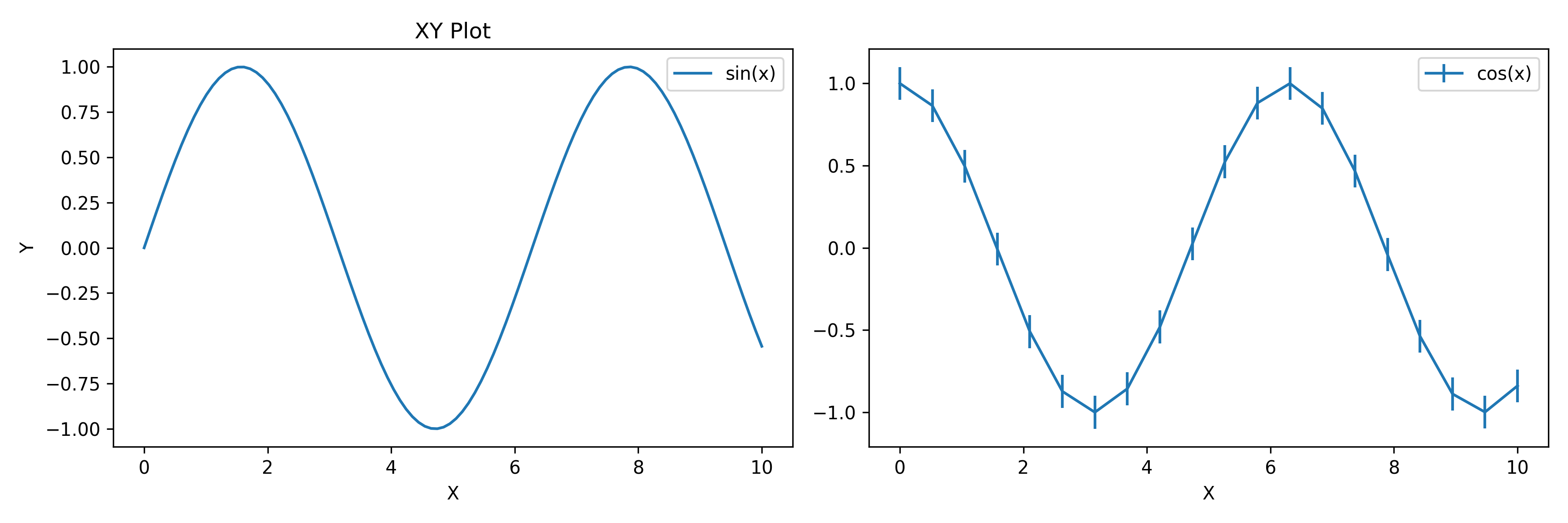
Mixing with Matplotlib
All plotez functions accept an axis keyword so you can drop them
into any existing matplotlib figure. Return types are axes-only:
Single-axis functions →
AxesDual-axis functions (
plot_with_dual_axes,plot_xyy,plot_xxy) →tuple[Axes, Axes]Grid functions (
n_plotter,two_subplots) → shaped(n_rows, n_cols)ndarrayofAxes
The parent Figure is always accessible via ax.get_figure().
import matplotlib.pyplot as plt
import numpy as np

from plotez import plot_errorbar, plot_xy

fig, (ax1, ax2) = plt.subplots(1, 2, figsize=(12, 4))

# Plotez on first subplot
x = np.linspace(0, 10, 100)
y1 = np.sin(x)
plot_xy(x, y1, x_label="X", y_label="Y", data_label="sin(x)", axis=ax1)

# Plotez on second subplot
x2 = np.linspace(0, 10, 20)
y2 = np.cos(x2)
y_err = 0.1
plot_errorbar(x2, y2, y_err=y_err, x_label="X", data_label="cos(x)", axis=ax2)
Next Steps
See API Reference for complete function and config-class signatures.
Check Changelog for version history.
Browse the
examples/directory for all runnable scripts.