Quick Start Guide#
This guide covers the shortest path from installing plotez to creating line and scatter plots.
Every example corresponds to a runnable script in the examples/ directory.
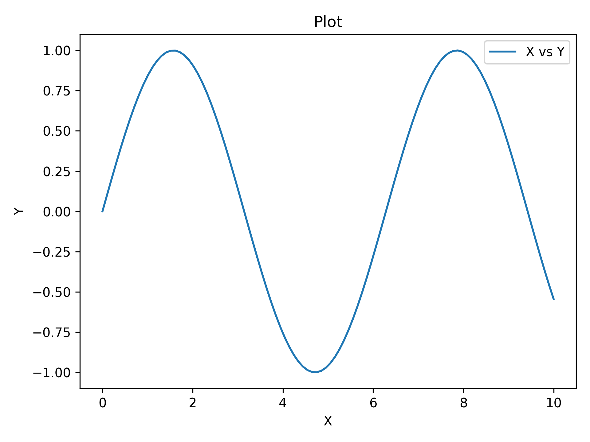
Minimal Example#
The absolute minimum code to produce a labeled plot.
Pass x_label, y_label, and plot_title for axis and title labels.
import matplotlib.pyplot as plt
import numpy as np

from plotez import plot_xy

x = np.linspace(0, 10, 100)
y = np.sin(x)
plot_xy(x, y, data_label="X vs Y")
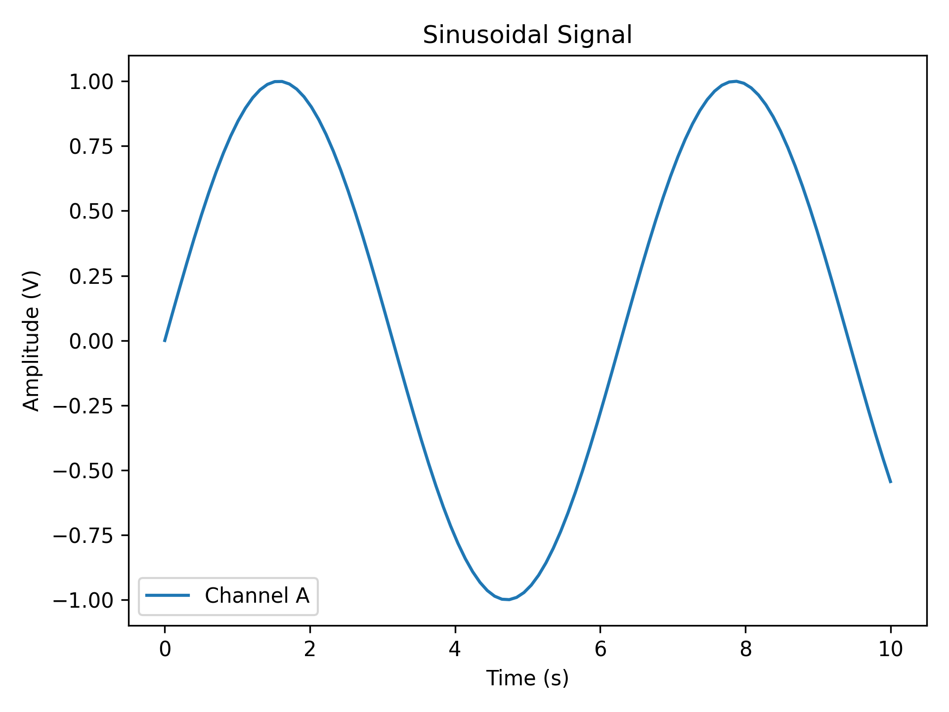
Custom Labels#
Replace auto-generated labels with meaningful scientific ones.
data_label appears in the legend; all label strings support LaTeX notation (e.g. r'$\sin(x)$').
import matplotlib.pyplot as plt
import numpy as np

from plotez import plot_xy

x = np.linspace(0, 10, 100)
y = np.sin(x)

plot_xy(
    x_data=x,
    y_data=y,
    x_label="Time (s)",
    y_label="Amplitude (V)",
    data_label="Channel A",
    plot_title="Sinusoidal Signal",
)
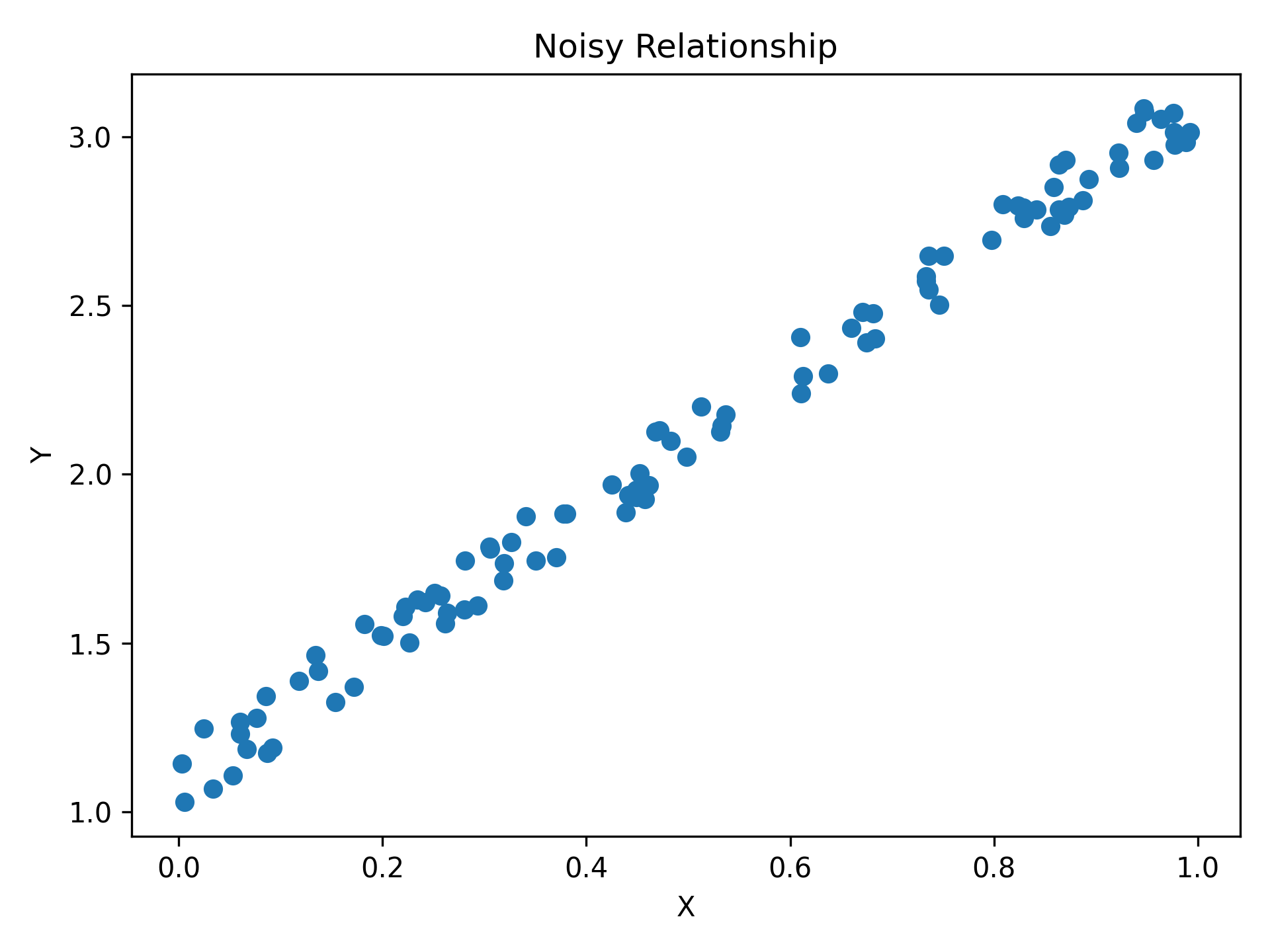
Scatter Plot#
Pass is_scatter=True to switch from a line to a scatter plot: same function, same parameters, one flag.
import matplotlib.pyplot as plt
import numpy as np

from plotez import plot_xy

# set a default generator for reproducibility
rng = np.random.default_rng(1234)

x = rng.random(100)
y = 2 * x + 1 + rng.random(x.shape) * 0.2
Continue Learning#
Error Visualization covers error bars, asymmetric errors, and error bands.
Multi-Panel Layouts covers two-panel figures, arbitrary grids, shared axes, layout management, and return shapes.
Configuration and Validation covers reusable config objects, shorthand helpers, exceptions, validation, and label collections.
Data Workflows covers histograms, density plots, two-column files, and integration with existing matplotlib axes.
API Reference contains complete function signatures and parameter details.